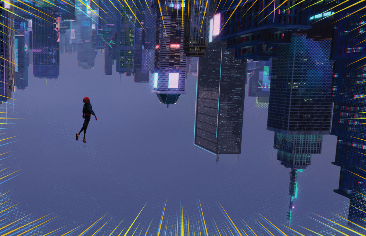
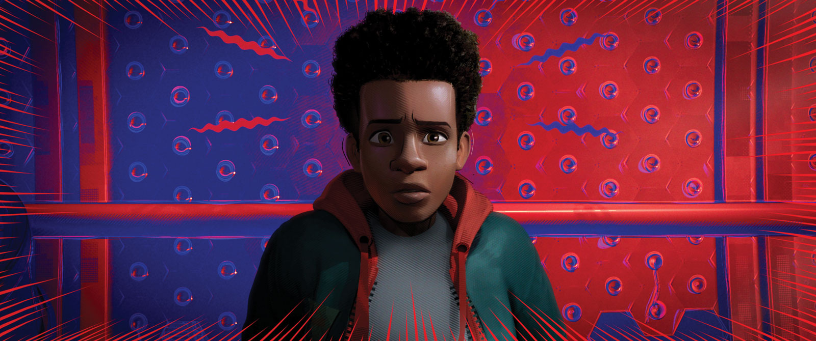
You can talk about artistic influences until you are red in the face, and about the men, women and creatures who have emerged from the parallel dimensions of the Marvel Comics Universe to mess with Miles Morales. You can talk about “stylized quantization,” patenting Ink-Line software, volumetric objects, and all of the amazing technology used to bring a comic book to explosive three-dimensional life on a movie screen.
But the directive to Sony Pictures Animation’s Justin K. Thompson as he began the multi-year journey that would culminate in Spider Man: Into the Spider-Verse was actually fairly straightforward.
“Make something I’ve never seen before,” recalls Thompson, Spider-Verse’s production designer. “That’s all anybody ever said to me. I’ve worked with [producers] Phil Lord and Christopher Miller for 14 years, and they gave me an incredible amount of autonomy. They told me how they wanted things to feel emotionally, psychologically and story-wise and pretty much asked me to create something they had never seen.”
Mission very much accomplished. Comic book enthusiasts have seen many of the techniques employed by Spider-Verse, but never on the big screen. Within the pages of comic books, readers accept thought bubbles, electrifying bursts of color, the onomatopoeic noises—“Ka-wham!, “Oof!”—of someone taking a blow. To transform the comic book universe into the world of the film—and to make it look believable and visually appealing—Thompson and his team had to use existing software in revolutionary new ways. This was true whether the object being rendered was an eight-armed supervillain, a Manhattan walk-up, a subway tunnel or anything else the artists could dream up.
“Maya and some of the rendering software is pretty much industry standard stuff,” says Thompson. “Once you get outside that, we pretty much had to develop everything from scratch.”
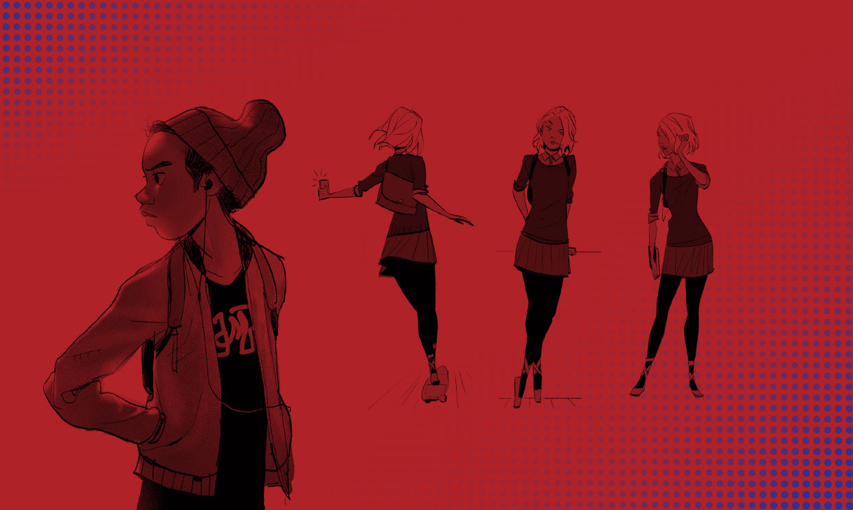
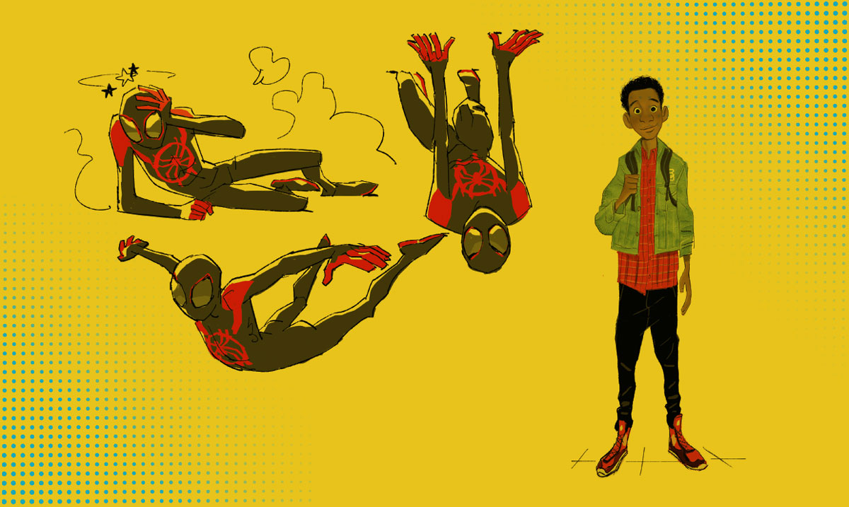
The teen-age graffiti artist Miles is at the center of the film, but Spider-Verse includes characters from a host of comic styles of different eras. There’s the Japanese Manga-influenced Peni Parker who travels with her own robot; the ‘30s era pulp comic, black and white Spider-Man Noir; the Mad Magazine-y Peter Porker (Spider-Ham), the Jason Latour-influenced Spider-Gwen and two Peter Parkers. Villains and monsters include old friends—or fiends—like the Green Goblin, Scorpion, Doc Ock and the Prowler.
The hand-drawn look of the film was painstakingly achieved through computer-generated images being revised via an overlay of hand-drawn art, making every frame resemble something out of a comic book or graphic novel. Even the deliberate blur of the CMYK offset—which looks like a misprint in the comics—is reproduced in the Spider-Verse.
2D in a 3D World
For a character designer like Omar Smith, the task at hand would be finding a way to negotiate the two styles.
“It was trying to find the volumetric shapes that encompassed all of Shiyoon Kim’s character design style that he established in 2D, but knowing that Justin Thompson and his entire visual development crew were going to apply all the crazy illustrative graphic designs on top,” says Smith, a 3D character visual development artist on the film. “I guess that would be the biggest challenge: trying to find the balance between nice 3D shapes that are going to work graphically with a 2D look.”
“They told me how they wanted things to feel emotionally, psychologically and story-wise and pretty much asked me to create something they had never seen.”
Justin K. Thompson
To make the characters both credible and consistent with the comic book style they were emulating, the Spider-Verse artists employed tools that allowed them to draw expressive linework or create reflections in 3D space. By using this software, one could put wrinkles around a character’s eyes and also use the soft color line of 2D animation, making it any color the animator wanted. The Ink-line software is one of several techniques from the film that Sony has submitted for a patent.
Connecting the Dots
Screentones and the use of reflective light are another game-changer. The team had to work to get the computers to create unique light sources out of the dots that mimicked the familiar Ben-Day dots of comics, but those dots were must-haves, according to Thompson.
“The value-added proposition to this movie is that you get to be inside a comic book,” says Thompson. “So I needed characters to be able to walk through these dots and be affected by them. If there’s a light source on screen, I needed it to actually interact with the character in an exact way. I wanted there to be one set of screentones for the highlights, one for the half tones and then another one for the shadows. If you look at the comics, that’s actually how they do it.”
“Nobody was sure it was going to work, and neither was I, but that was like the theme of filmmaking the entire time.”
/ Into the Spider-Verse
For the buildings that fill up Manhattan, Brooklyn, and the other three Boroughs, the film’s software designers employed a device, which came to be known as the Magic Cube. The cube placed randomly-generated shape patterns in all of the windows, helping to give all of the structures a uniqueness. During a subsequent visit to New York, Thompson strolled around and noted how closely the Magic Cube patterns seemed to match what actually existed.
Shady Character
Creating human skin tones to synch up with the graphic style of the film was a trial and error procedure that took a year to perfect. According to Thompson, having the characters integrate seamlessly into the graphic environment was a constant challenge and matching up the skin was especially difficult
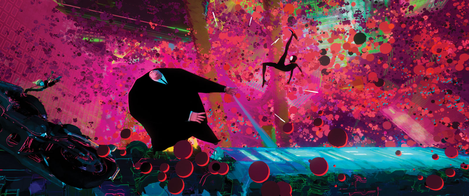
Consider the villainous Kingpin, an enormous figure whose head and hands seem to be in different planes from his body. Thompson envisioned the character as a nod to the Kingpin rendered in Bill Sienkiewicz’s “Daredevil” comics.
Where most of the other characters were chiseled or otherwise well-defined, Kingpin was largely defined by his girth. But the character had to be able to emote, not come off as what Smith calls “a huge slab of meat.”
“You wanted to feel that he wasn’t a blobby character, but a character of mass and structure,” says Smith, who worked extensively on the character with Thompson. “Once again, you’re working with all of these awesome shapes, and you know that visual development is going to come in and really determine how the lights will react with all of these folds and wrinkles.”
Thompson conceived him as a vast silhouette and wanted to figure out a way that the character could appear to reject all sense of space. The artists ended up rigging the character’s head, hands and body separately and hiding the points of detachment. Considering that the character would engage in an effects-laden battle with Miles at the film’s culmination, Kingpin had to be visually strong.
“It has to feel like the character has volume, but you can’t actually sense the volume, just have a black silhouette with hands and head that sort of float around,” says Thompson. “Nobody was sure it was going to work, and neither was I, but that was like the theme of filmmaking the entire time.”