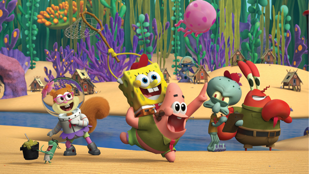
For two decades SpongeBob SquarePants, the extremely enthusiastic, under-the-sea dwelling character, has been entertaining audiences. This year marks his third feature-length film, but the character, and his cohorts in Bikini Bottom, may look different when audiences view The SpongeBob Movie: Sponge on the Run.
That’s because, for the first time, the long-running animation franchise is coming fully via computer generation. (It also comes with its own accompanying SpongeBob prequel series, Kamp Koral: SpongeBob’s Under Years, which is also produced in CG with plans to air on Nickelodeon.
“It adds just another layer of intrigue because we’ve never seen a SpongeBob movie like this,” Sponge on the Run director Tim Hill explains of the decision to change things up after the TV show and previous two movies mainly relied on 2D animation.
With Sponge on the Run, Hill—who became part of the franchise during its nascent days as an increasingly popular Nickelodeon program—says his goal during the film’s development was to figure out if you can make it new and different without breaking it.
He says “the challenge is the show has a specific look and a specific style,” such as its use of blurred “painterly” walls in the background.
“You don’t want to repeat that in CG because that’ll just be kind of more of the same,” Hill says. “So the idea, for me, was [to] make really dimensional backgrounds without making it seem like it’s not SpongeBob.”
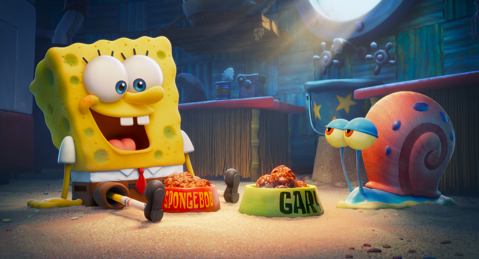
It was also important to find a way for the film to pay homage to SpongeBob creator Stephen Hillenburg, who passed away from heart failure associated with ALS in 2018. Hill, whose relationship with Hillenburg dates back to the 1990s Nickelodeon hit Rocko’s Modern Life, says the film’s plot—SpongeBob is looking for his lost pet, Gary the Snail—was something that the late creator “always thought would be a good premise for a movie.” Hill says Hillenburg also “didn’t really like to do scripts” and would “organize ideas from storyboard development.”
Hill says the Sponge on the Run crew was made up of artists from the television show to help “keep a lot of that ethos going.” But he also hired talent new to the brand who could come to it with a fresh perspective.
This includes Rachel Tiep-Daniels, who has earned her first credit as a production designer thanks to this film. She says she wasn’t a SpongeBob superfan before she was hired, although she—of course—knew about the show and films and “very much appreciated” them. She says coming onto the project with fresh eyes, especially since it was transitioning to CG, allowed her to “really dissect it in a different way.”
Tiep-Daniels says that, while it was important to “keep everything grounded in the foundation and original style of SpongeBob” the TV series, she and the team also “created rules of color, patterns, shape, and style for everything in the film.”
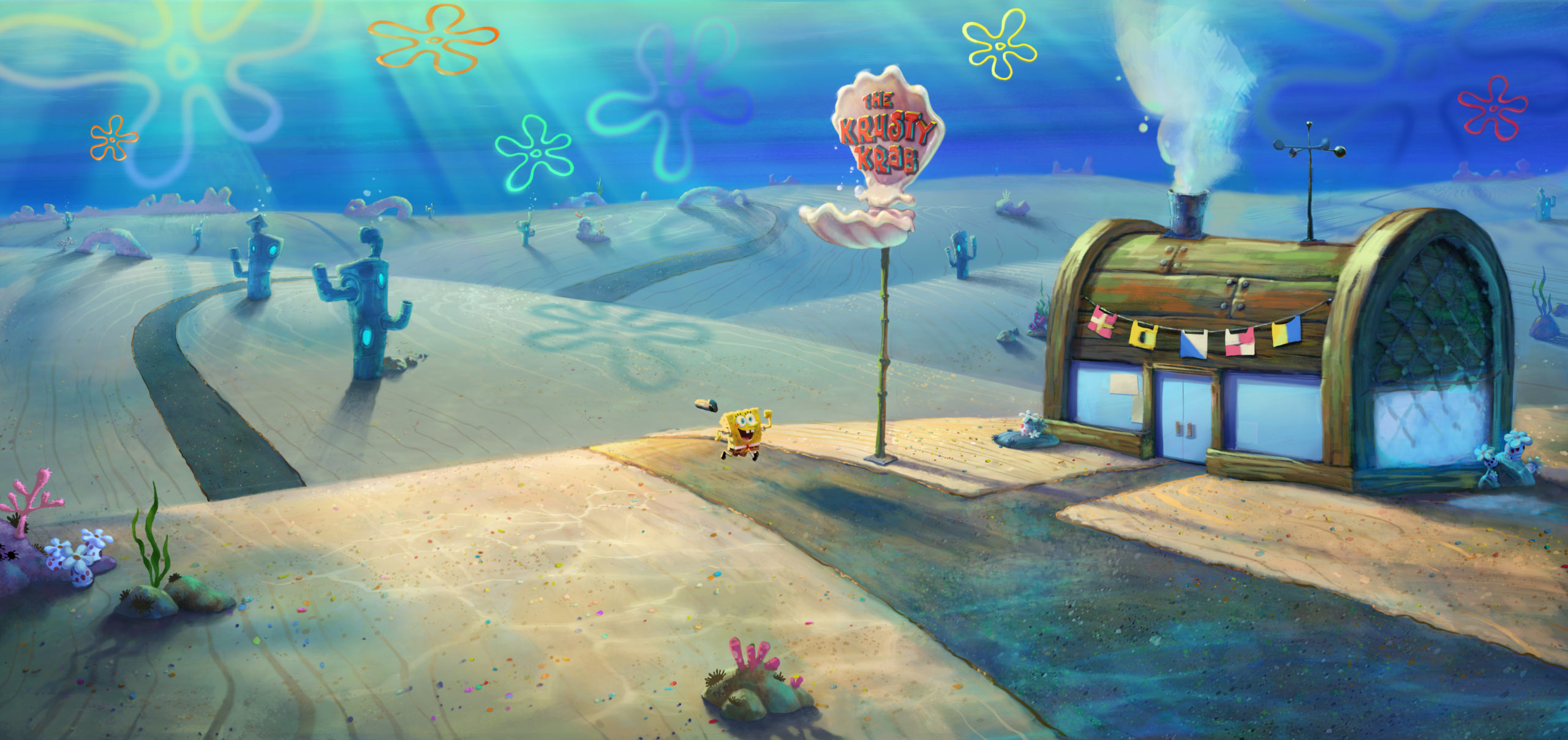
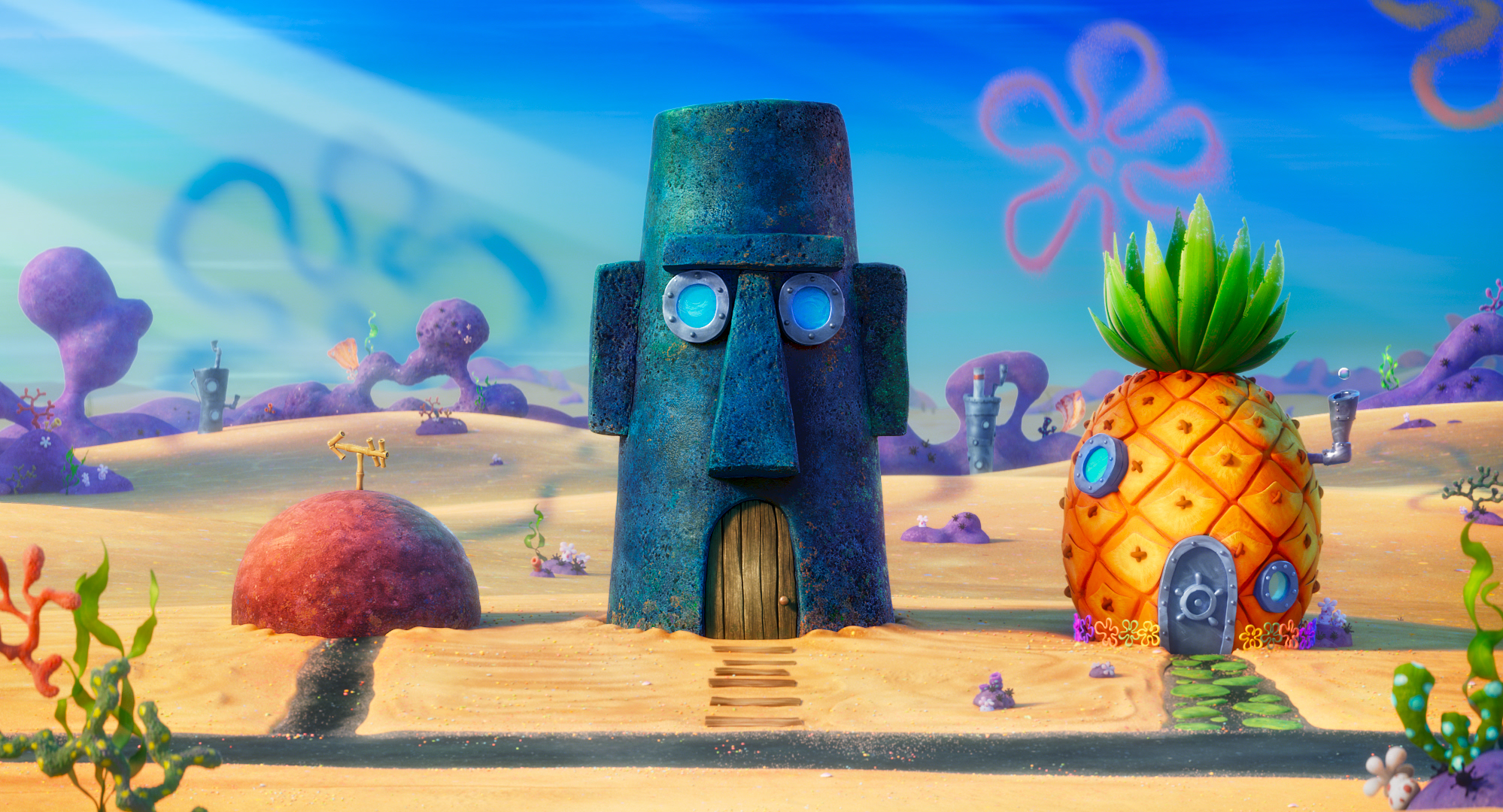
This meant that she could make the exterior of SpongeBob’s dwelling, the infamous pineapple under the sea, a “hybrid of a realistic texture and sculpted elements.” She says there’s a gradient “for the representation of color and light of the overall base of the pineapple [which starts] from the outside going in” with red shadowing to orange and then to yellow, which she says is the most exposed. This final color layer “applied on top of the base surfacing of the pineapple” was a “detail that helped keep it familiar to the show and cartoony.”
“In the TV show, they use the gradient of color to indicate light and shadow,” Tiep-Daniels adds. “I found without this treatment layer, it was either too simple, or it could look too much like a realistic pineapple.”
Hill also worried that, in transferring to CG, the characters would end up looking like what he describes as “bath toys—shiny, plastic characters.” Even SpongeBob himself goes through what Hill explains as “a weird math” when he’s turned into CG. If you’re not paying attention, Hill says his lead “can get really weird looking, like his head looks like the top of the table. [So] I had to be careful with lenses because he can get distorted really fast.”
But, he says: “We had an advantage of having underwater animals” as opposed to humans. Plus, they wanted a chance to rethink the small amount of CG animation that was used in some live-action portion of the previous movies, 2004’s The SpongeBob SquarePants Movie and 2015’s The SpongeBob Movie: Sponge Out of Water.
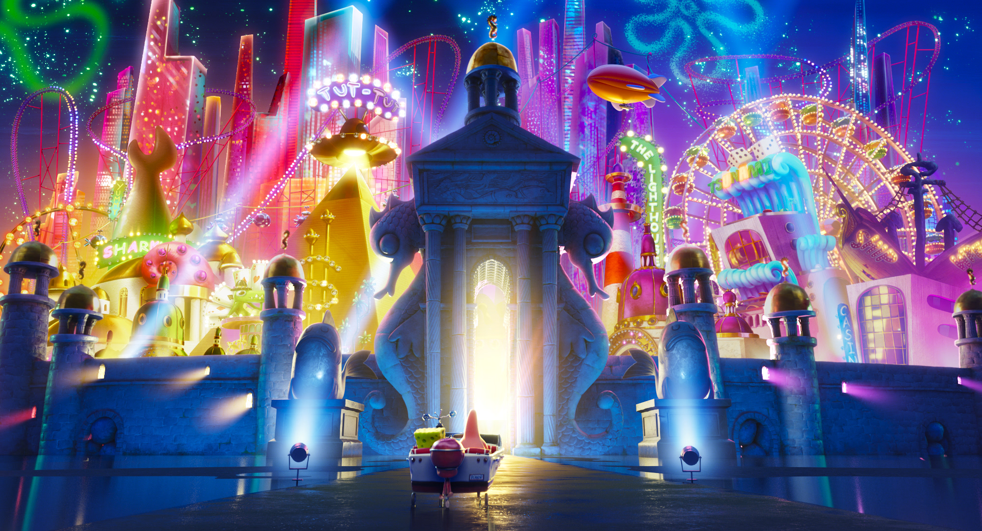
“I pushed pretty hard to get the surfacing right and the feeling right and it gives a lot of dimension to the image,” Hill says, adding that some of the technical strategies used in lighting and modeling made the characters and backgrounds come alive onscreen.
This is particularly handy, he says, when you’re dealing with a world set on the Pacific Ocean floor. Hill and his team explored the use of caustics, or the optics of how light rays would appear on a surface or creature after they’re projected through water. With respect to surfacing, he says improvements in technology have helped with issues like “how the characters look … is SpongeBob too shiny on the surface? Is it too, kind of, spongey or felty?”
Tiep-Daniels says that she also worked closely with Sponge on the Run CG Animation Director and Head of Character Animation Andrew Overtoom on translating the characters to CG—and that they even went so far as to laminate creator Hillenburg’s “guide of rules, shape language and proportions” for what she describes as their “bible.”
“After matching the proportions, we would take a step back and work with the artist to sculpt the extra details, making sure that the characters worked in all angles, in order to bring each character to life and make them believable,” Tiep-Daniels says. She explains that since all the characters in the movie have some sort of asymmetrical look—be it ill-proportioned lips, eyes, clothing, or something else—it was essential that “the characters needed to be thoughtfully modeled to ensure that the iconic and extreme expressions would read and move correctly.”
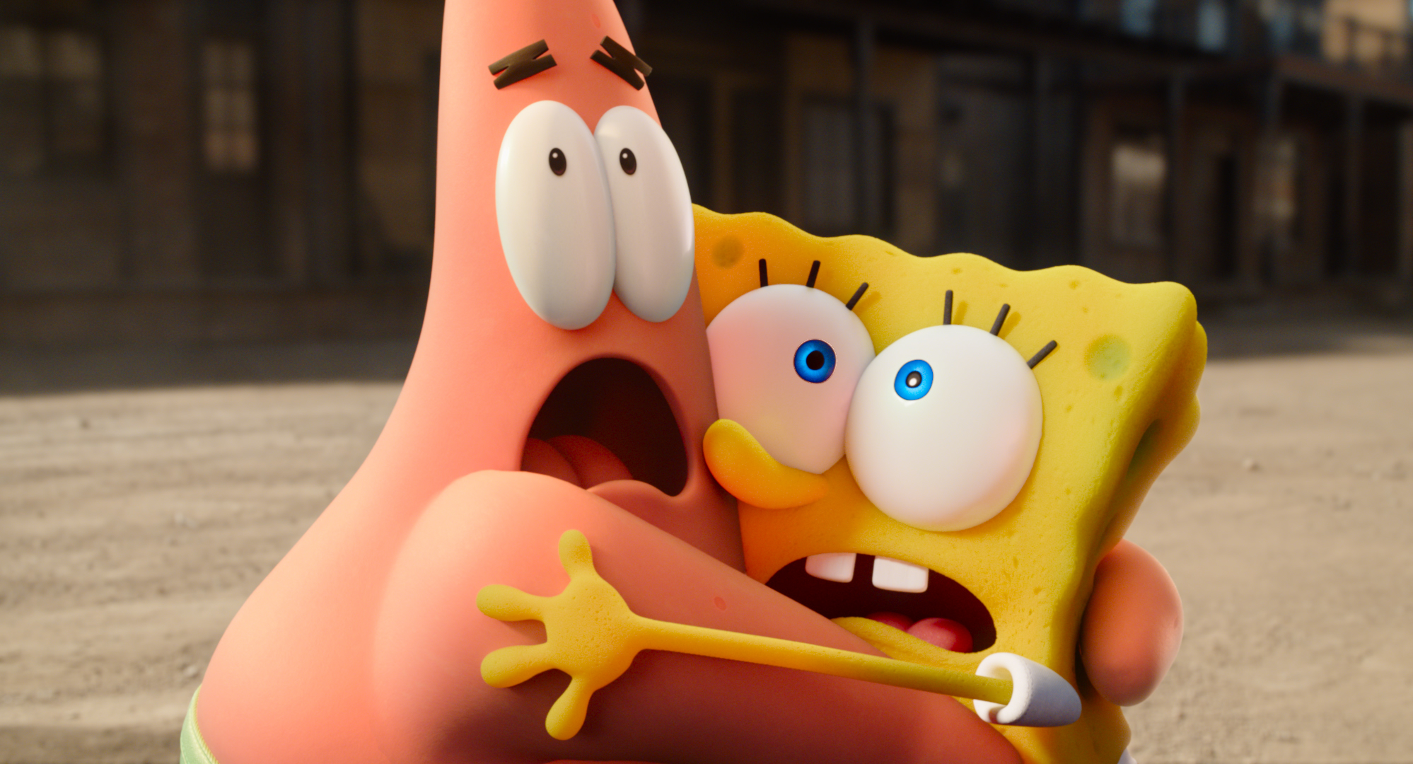
Making these main characters stay consistent through various setups became a major lighting and compositing challenge. It was important to ensure that SpongeBob is still “yellow with large green pores, and a green shadow side” she says, and that his translated material looks “soft and spongey, with large and small secondary pores.”
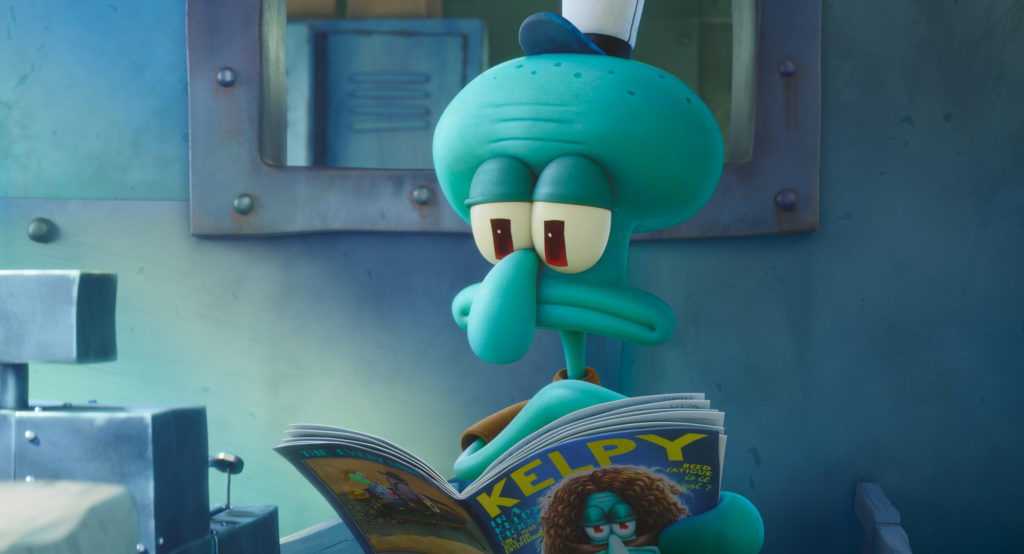
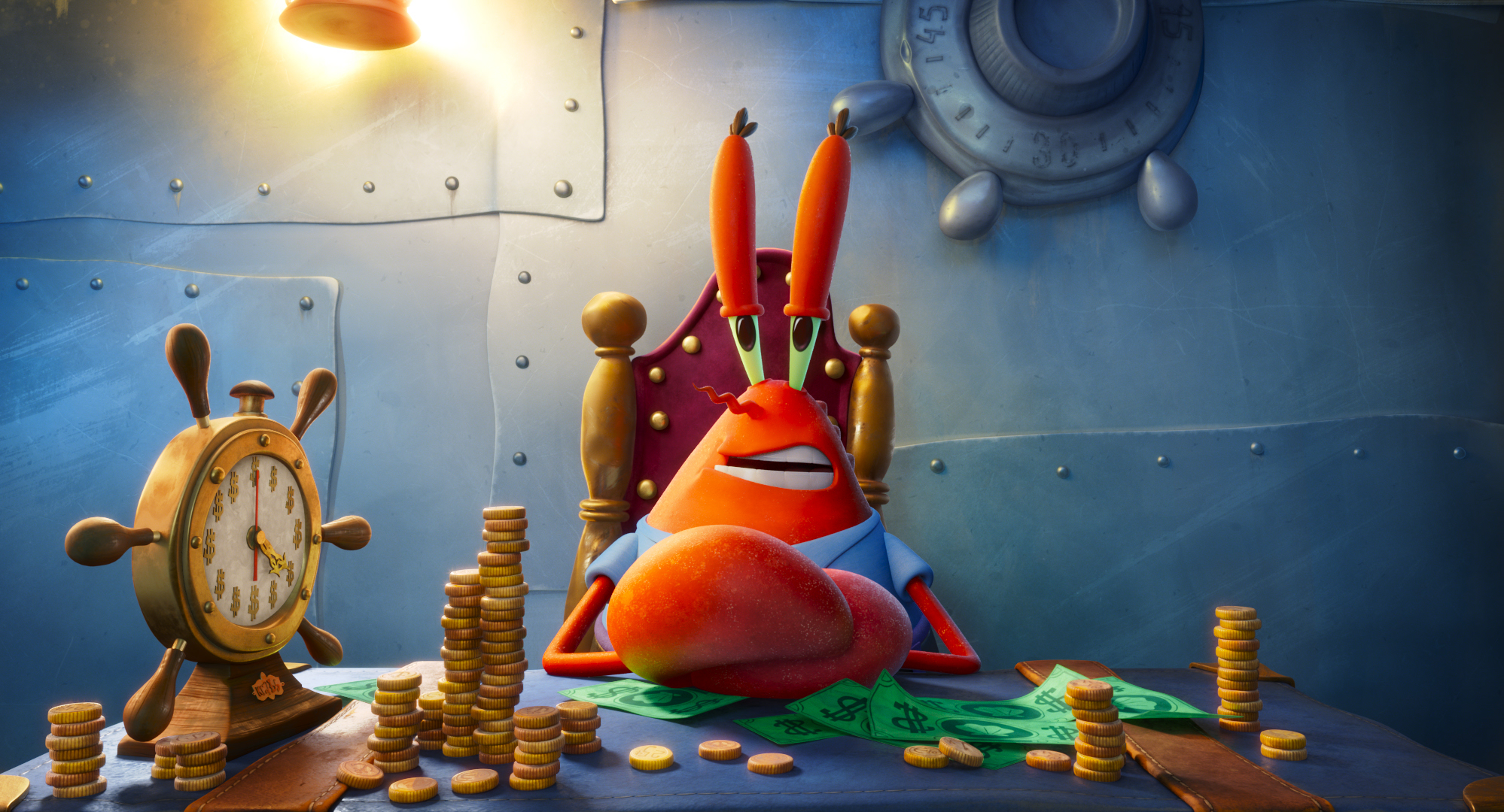
While SpongeBob’s unbeknownst- to-him sworn enemy, Squidward, is “a combination of a squid texture and his local color and pattern.” Squidward’s head, which Tiep-Daniels describes as shaped like a loaf of rye bread, and mouth were challenging in part because she says “he is three-and-a- half heads tall” in Hillenburg’s notes. Greedy boss Mr. Krabs was “a hybrid of realism and brush stroke style and pattern” so as to keep him from looking at all realistic. This meant “reducing the amount of shell texture, creating color variation and a subtle shell feel.”
So are these artists prepared to show off their modern take on a beloved TV show’s core design principles? It seems fitting that Tiep-Daniels says she’s taken to saying SpongeBob’s favorite catchphrase: “I’m ready.”