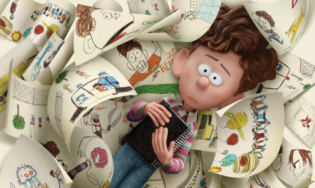
Multi-Layered Magic
Spider-Man: Across the Spider-Verse
Character Designer: Kris Anka
In Spider-Man: Across the Spider-Verse, Miles Morales is catapulted across a multiverse filled with Spider-People. All of them are charged with protecting its existence, and all of them have very different ideas about how to do this. Especially Miguel O’Hara, AKA Spider-Man 2099.
Unlike Miles and his predecessor, Peter Parker, Miguel intentionally altered his DNA to become a Spider-Person. Because he played a role in his own transformation, he is as multi-layered as the movie he inhabits—literally. Character Designer Kris Anka approached Miguel in stages, adding layers throughout the process to develop the complexity of this superhero.
When Anka was invited to work on Across the Spider-Verse by Joaquim Dos Santos, the film’s director, he was already familiar with Miguel. A CalArts graduate, Anka had been working at Marvel comics for eight years, even designing one of Miguel’s suits. He had worked in animation before his Marvel stint and was ready to return. Little did he know that his three-month contract would extend to three years, with much of his time focused on Miguel.
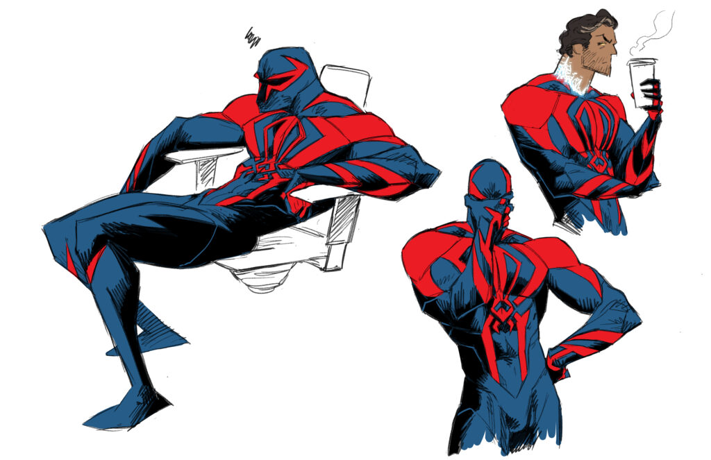
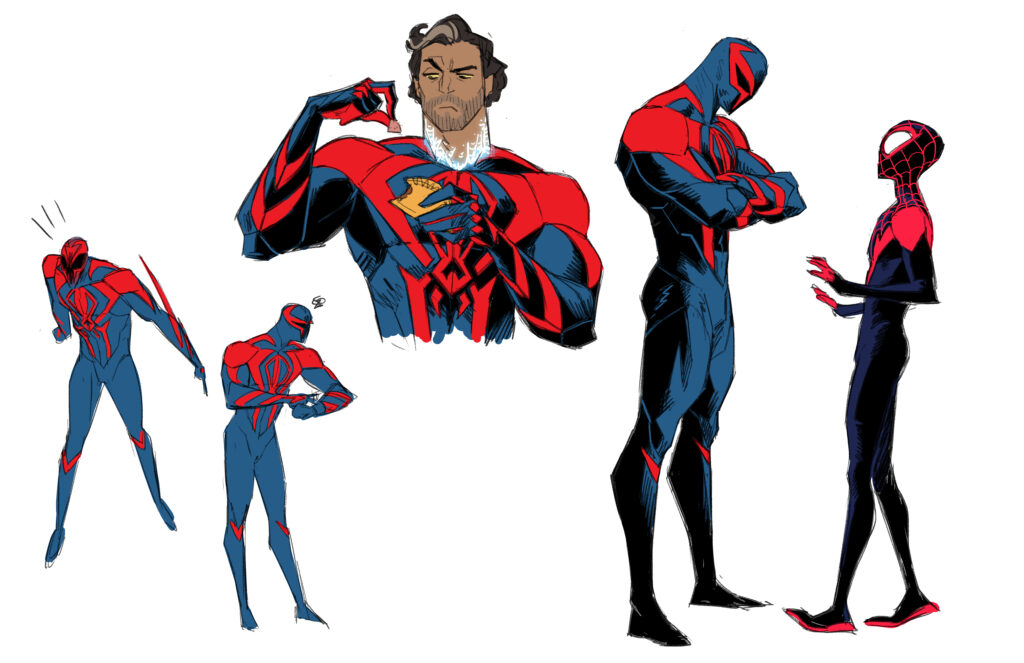
While Miguel exists in comics, and screen audiences got a glimpse of him briefly in the end credits of Spider-Man: Into the Spider-Verse, Anka says the sequel’s creative team wanted to take a new approach to the character. Some early pre-concept work had been done, and “they knew the vibe they wanted,” he says. “They wanted Miguel to be someone who was very proactive. He always had to have a presence. When he walked into a room you think, oh, this guy takes things more seriously than everyone else. He had to move in that intentional way—I’m on the hunt—physically intimidating.”
The film’s Visual Development Artist Spencer Wan did physicality animation tests, giving Anka an understanding of the impact of Miguel’s weight. Miguel has claws and doesn’t stick to walls, “and he’s not lithe, he’s not an acrobat. He’ll go through a wall rather than find some artful way around it,” Anka says. Working with his musculature, he had to figure out how to make Miguel fit in with the visual language of Spider-Man while at the same time stand out among the other Spider-People from the previous movie.
“[Miguel] always had to have a presence. When he walked into a room you think, oh, this guy takes things more seriously than everyone else.” —Kris Anka
“We had two very separate approaches with him,” Anka explains. The first was translating the comic design into a character that would work in animation. While the strong red and blue silhouette would remain, in animation action scenes with a lot of movement, “Miguel could accidentally become a muddled mess because of all that blue,” says Anka. He added red to Miguel’s palms and soles, designed red arm bands that angled in specific directions, and created a red design for the back of his suit that looked different from the front to make sure the audience could always tell what side of his body they were looking at.
With this initial design done, Anka sent Miguel down the pipeline. Then the vis-dev team told him they were working Mesoamerican Burle Marx-influenced patterns into the backgrounds. Marx was a Brazilian landscape architect whose style had distinctive patterns. Like the other Spider-People, Miguel inhabits his own universe—Nueva York in the year 2099. Anka was asked to return to Miguel to unite the character’s look with his world. “To make everything feel that Miguel was born in this culture,” he says.


Anka spent the next six months focused on working in patterns without breaking the original silhouette. The blue parts would have a faint pattern underneath the digital texturing; the red parts would have the same pattern, but it needed to be stronger. Overall, they wanted three different layers of detailing to the suit, and the challenge, Anka knew, was to “add a sophistication to the design without it being ham-fisted and too noisy. Things can get really loud really fast.”
Anka was given some loose patterns to work with, but nothing lined up. He researched everything from Marx’s designs to Mesoamerican textiles to architecture for inspiration—and set about experimenting. He tested what would happen if the pattern was curvier, straighter, softer, or more hard-edged. Then he had to ask, “Where does everything fit so it all looks intentional to the anatomy?”
His method was to take all the red parts—the mask, the chest, the arm bands, and the legs—and use each to show how he could break down the pattern and still retain the silhouette. He had vis-dev choose which versions of each body part they liked best. Once he had that, he says, “I would try to holistically find commonalities between those patterns and bring it all into one unified piece.”
Now that Miguel was ready to move down the pipeline again, it was decided that Anka would translate the geometric patterns he had designed directly onto the model—not a usual role for a Character Designer. But nothing about Miguel and the rest of the Spider-People was usual. “Every design is wildly asymmetrical including Miguel’s body,” Anka says. But because he’d been thinking about the patterns for so long, “I could figure out, how does this all really sync up, [so] when it went into animation, everything lined up already,” he says.
On and off, Anka spent 16 months working on Miguel. It was a laborious process, but one he gladly undertook in service of the ultimate payoff—a design, he says, “that feels effortlessly that character by the end.”
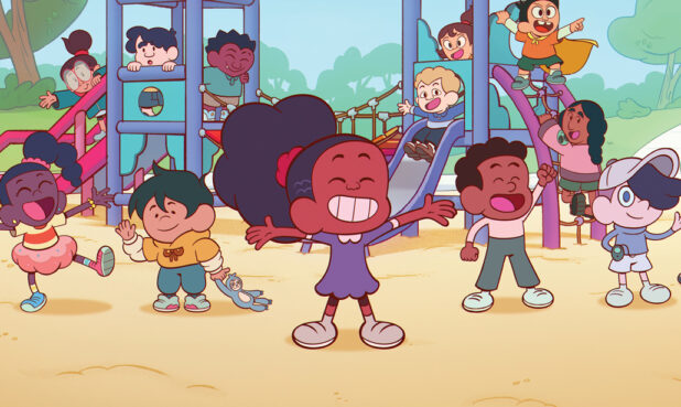
Within the Lines
Monster High
Character Designer: Bertrand Todesco
Designing a character is never a solitary venture, but the extent of collaboration can vary widely. For the new reboot of Monster High, Lead Character Designer Bertrand Todesco had to work not only with the style of his own team at Nickelodeon, but also with Mattel—the creator of the Monster High IP, which includes dolls, an original TV show, live events, and a live-action movie. Having so many parameters could feel binding to some. Not so for Todesco who says, “I’m a solution-driven person.”
Born and raised in France, Todesco began his animation career there. By 2017 he was in Paris freelancing on the series Glitch Techs, where he worked with Art Director Scott Kikuta. A year later Todesco moved to the U.S. for work, and when Kikuta landed on Monster High, he hired Todesco to handle the multiple character design needs.

Todesco was excited. He had been a fan of Monster High from its start. The series is about the teenage children of monsters and the high school they attend, and Todesco finds Abbey Bominable the most interesting because she doesn’t descend from a typical monster like Frankenstein or Dracula. She’s a yeti, and with his love of mythology, he was eager to transform this creature into an appealing teenager. He was also happy to have the freedom to move Abbey’s silhouette away from earlier iterations. The new Monster High characters have all kinds of body shapes. “It was super important for us to have everybody be able to recognize themselves. To relate to characters,” Todesco says.
Because she is a yeti, Abbey is tall. She’s also sporty and shy. “This is the kind of information we were given,” Todesco says. “It included patterns, color palettes, a mood board with inspirations.” He also received the new doll prototype, and because Mattel was working on the dolls at the same time he was working on the TV show concepts, there was plenty of back and forth with the designs. “It’s interesting because they give us some ideas, and with those ideas I make something different, [because] it’s for a different medium … a different purpose,” he says.
One of the first challenges Todesco faced was fur. In the beginning he wanted Abbey to have short fur like a yeti, but it was difficult to transfer that into CG in a way that stuck to the budget and scheduling restraints of a TV show. As well, the result moved too far away from Mattel’s concept, and he wasn’t able to make it look convincing with the technology available.
“It was super important for us to have everybody be able to recognize themselves. To relate to characters.” —– Bertrand Todesco
This didn’t trouble Todesco, though. He calls it reality and says, “That’s what’s supercool. You have to find solutions. I always make different proposals, and if some proposal is not the best, we can repivot to some other idea. You have many ways to draw one character—to adapt one character.” His pivot in this case was to give Abbey an iridescence and incorporate snowflakes into her clothing to reflect the snowy climate she comes from. And he was still able to work in some fur by using it on her cuffs and shoes.
“You have to find the best way that works for the show’s [CG] technique,” Todesco says, to avoid technical problems. Another example he gives is the feet. The animated characters needed bigger feet than the dolls. “In animation you need to have the shadows on the floor. You need to see the contact,” he says. If a character is given long legs and very tiny feet, when they are running, it can look like they are flying. “It really helps the animation that they have bigger feet.” At the same time, he had to make sure larger feet didn’t look clunky and weird.

Other issues Todesco had to address included hair. The Abbey doll has hair to her knees, but it was too difficult to make that same style work in CG. He also had to rework Abbey’s pants. On the doll, parts of the pants are transparent. Because 3D models are made of polygon shapes, when two shapes overlap—like the joints at the knee—you can see them “collide” against each other. To avoid this, Todesco had to rework the design with an opaque fabric.
While Todesco enjoyed the technical aspects of working on Abbey, he connected with her on a personal level. “She’s from the southeast of Asia, and she has an accent. I’m from a different country, and I have an accent,” he says. Diving into the cultural aspects of the character with a cultural consultant, he says finding ways for the audience to understand visually a character’s cultural background can get tricky. “You have to be cliché, but also not [create] a caricature,” he says. He offers his own country as an example. “If we have to create a French character, I don’t know if I would give him a baguette and a beret. At the same time, it’s a cliché that works.”
Being in on the ground floor, Todesco was able to follow the characters from their initial concepts to the final models. “It’s rewarding for me to see the full process,” he says. And despite all the influences coming from various directions: “It gives you boundaries. I really love when I have to create characters from scratch, but for this show it’s cool because … I’m working with CG. I’m working with the Art Director. I’m working with the Showrunner. We are all working in the [same] direction to make the best character.”
Edgy Evolution
Krapopolis
Character Designer: Andy Ristaino
When Character Designer Andy Ristaino starts working on a character, he riffs, drawing many different designs. It’s an approach that’s served him well over a career that includes Storyboard Artist on Midnight Gospel and Designer and Storyboard Artist on Adventure Time, where he earned an Emmy Award for Outstanding Individual Achievement in Animation. Landing at Bento Box to help develop pilots, “They’d bring in new projects, and I’d take a stab at what the look [would be],” he says. “They had other designers do the same thing for Krapopolis, but they finally chose the stuff I did.” Stuff, he adds, that looks drastically different from the designs they finally landed on.
Not that this troubles Ristaino. “We’ll get closer and closer, and at some point they’ll be like, this isn’t quite working. We’re not back to square one, but we’ll take where we’re at and redesign it and go in different directions. … For each of these characters, there is a long evolution. For me, that’s what’s most interesting. To see how a character has changed before we even get to see them onscreen.”

The forthcoming Krapopolis is an adult animated TV series from Rick and Morty co-creator Dan Harmon. It’s about the start of one of the world’s first cities in mythical ancient Greece. Among the characters Ristaino designed for the show, Deliria is the mother of the main character, King Tyrannis. She is described as the goddess of self-destruction and questionable choices—it’s no surprise that she almost always has a wine chalice in her hand. “When we first started working on her, they were thinking more Elizabeth Taylor and Cleopatra—that kind of look,” Ristaino says. But this didn’t feel right, so he kept riffing. “There are designs that made her look more rock and roll and edgier, and designs that made her look more like a goddess.”
Even though Deliria has been kicked off Mount Olympus, as the creative team developed her personality more, they wanted to show that she was still a god, which meant she had to look regal. At the same time, Ristaino says: “She’s a rebel god. She likes to do things her own way and she doesn’t take guff from anyone.” To get this idea across Ristaino made her a little messy—loose hair and her gown sliding off her shoulder. He also used her eye design with its gaudy makeup to convey her defiant attitude, explaining, “I was thinking about Agnes Morehead from Bewitched.”
“For each of these characters, there is a long evolution. For me, that’s what’s most interesting. To see how a character has changed before we even get to see them onscreen.” —Andy Ristaino
Despite Ristaino’s significant role in designing the characters, he doesn’t feel the show is representative of his style. He describes his design sensibilities as abstract, cartoony, and freeform, while Krapopolis is more realistic than what he usually does. That said, he can still see what he calls DNA from his sensibility in Deliria’s hands and feet, her hair, and her eyes. “There’s a simplicity to Deliria’s design that feels more like what I would have brought in,” he says.
Was it hard to embrace a different style? He says it’s still a challenge, but adds, “I love the process.” Early on he spent a lot of time hanging out with Harmon. “He thinks out loud. I loved being a part of that and getting a window into his thoughts,” says Ristaino. As he collaborated with Harmon and others, the style of the characters evolved, with Ristaino “keying in on what they wanted through my designs. … I’ve been working on this show for over two years now. It’s like you grow into the role. You learn, oh, this is how you do this from drawing the characters over and over again.”

But drawing Deliria to the point where everyone was happy with the way she looked did not mean that he was done. Once the animation process began and footage started coming back, they realized that they needed to fix her turn. Ristaino explains that for each main character, an eight-point turn was designed for a 360-degree view. “For Deliria, when her front view transitioned to a side view, there was something weird happening with the turn,” Ristaino says. “We had to go in and redesign her head a little bit, and redesign her front view, just to make it work better in animation.”
For such a small issue, it may seem like a lot of work, but Ristaino explains that a turn can be essential to understanding a character like Deliria. “With any character, that’s the challenge,” he says. “Trying to get someone’s personality across.” How do you dress them to express that? How do they stand to express that? And how do you pull it all off without making it too obvious? In Ristaino’s case, he keeps on riffing until he gets it right.