Can you imagine the Iron Giant singing rock songs written by The Who’s Pete Townsend? That was almost the fate of the soulful robot before Brad Bird came to Warner Bros., with just three months left on his Turner Feature Animation contract. He was told to look at Warner’s 50-some projects in development and choose one.
“The Iron Giant seemed intriguing to me,” says Bird. “I read the Ted Hughes book, and I didn’t see it as a musical. I felt that the core of the story was between the giant and the boy. I took the story as a starting point and a question occurred to me—‘What if a gun had a soul and didn’t want to be a gun?’”
Bird gathered a crew together, many of whom where young and talented but didn’t have much experience. “We threw these people into the deep end and gave them challenging and difficult scenes,” says Bird. “My rationale was if we take the strengths of all of us and put them together, we’d have enough to have a super animator.”
He also encouraged the artists to speak up, though for the first two months no one expressed their opinions out loud. Finally, he heard an “ugh” in the crowd and encouraged the artist to come forward and share his thoughts. The person erased Bird’s drawing and offered another solution. “I thought it was great,” remembers Bird, and from that moment a little barrier was crossed. “The team’s ability as a unit just skyrocketed.”
Another team strengthening tactic was to invite the leads of all the different departments into the editing room to help keep everyone on the same page. “It was like those photos of phone booths, where college students would pack themselves into [one] to see how many people could fit,” says Bird. “You couldn’t move.”
At one of these screenings, they showed the scene of the Iron Giant and Hogarth talking about death. It was still in storyboard format but it had music and great drawings. “It’s a delicate scene; it was hard for me to write,” says Bird. “When [the giant] finishes talking with Hogarth, Hogarth gives him this lovely little pat, which Kevin O’Brien storyboarded into the scene. The giant rolls over, and now he’s facing the stars and eternity. His view is opened up, and he says, ‘Souls don’t die’…we looked around and everyone was kind of starting to cry. We thought, we might be on to something.”
The film opened on July 31, 1999 and was viewed as a box office dud though The Iron Giant received tremendous reviews and swept the Annie Awards. Only years later, would the film grow into a cult classic and celebrated.
“I felt like we were the Bad News Bears and that we rallied together and made something that hopefully will stand the test of time,” says Bird.
Indeed, they did.
William Frake
Head of Layout
Frake had just wrapped up Quest for Camelot at Warners when producer Max Howard mentioned a new project called The Iron Giant with Brad Bird, a name familiar to Frake. “I remembered him from when he was 16 in the training program at Walt Disney Studios— everybody was in awe of this little kid. I said, ‘Yes, whatever he’s working on, I’d love to work on it.’”
It was such an innovative idea and only a few people knew about it. We went up to Rockport, Maine to go through the locations, the junkyards and the small towns. Brad was a big believer in having the experience first and then drawing from your experiences. When we walked through the towns, we really got a sense of the environment, of the people. It was like an emotional scouting trip.
“There’s a couple of films in your lifetime if you’re lucky to work on them, they last beyond your lifetime. It wasn’t a job, it was an experience, it was a kind of love affair.”
One of our realizations was that it was 1990 in Maine, but it felt like the ‘70s. I asked Brad, “What period is this taking place?” He said, “In 1959, 1960.” And I said, “If that’s the case, they would have stuff from the ‘30s and ‘40s.” I also brought in my collection of Saturday Evening Posts from the 1950s and the 1960s, and we laid them all on the table. You could see the toys, the clothes, the people, the events, the concerns of the cold war—and we really got everybody up to speed. It wasn’t like making tires; it wasn’t a factory. We had the vision of the car without even building it.
I was head of layout on the Toontown section of Who Framed Roger Rabbit so I was familiar with a lot of the restrictions. The idea was to create CG grids on the ground for the Iron Giant to walk on, and then the technique would be kind of like Roger Rabbit—to then paint an actual 2D background on top. When the giant walked, he would walk in a 2D background registered to the character.
Once they animated the giant—that was the God mode—basically everything tracked to match where the giant was. We’d draw around the character, which is kind of opposite of standard 2D, rough it out, put a background, and then animate it, and then you put your backgrounds over top and clean it up later. But to save a lot of time it had to be figured out in storyboards first—how you want to frame it on the screen?
It’s a vertical character on a horizontal environment, which was really hard to get scale on. I did a lot of staging and composing to get the giant to feel really big. Mark Andrews’ storyboards were just right on the money but once he got done in story, how do you make sure it fits in this little box? We were always going back and forth, and Brad was a big fan of—you don’t have to show everything to see everything. If you see the foot of Iron Giant next to a human object, like a car, you know he’s really big.
Everyday was a challenge, and I really loved it. We didn’t have the technology they have now so I called friends at LucasFilm, took a week and I built the entire town in a model with the streets and the little diner and forest so we could now literally have a visual interpretation. I also got an architectural program, formZ, to build Hogarth’s house. Once we got the rooms where we wanted, you could show it to the board artists, and they would get the story down.
This set was very interactive and the background was an additional character. If you have one character and the environment, that’s two characters in the scene. And then an objective viewer, the third character, is the camera that’s watching what’s going on. Once we had that triangle established, then we could do the traditional 2D camera work, to adjust the cameras where Brad wanted them. But then if they had the Iron Giant in the scene, you would do computer tracking of the camera. If it didn’t work we’d try something else.
We had half the schedule, half the time, half the money. For instance, we were told, “You cannot have any snow because you’ve used up all the money.” I remember Brad said, “We need snow, it’s a story point.” We painted snowy backgrounds in 2D, with a couple of little snowflakes, and then towards the end of the film when the snow has to come down, we used effects.
When I started to see the dailies, I was shocked at how beautiful it was. I realized we had an amazing film on our hands, and I was very surprised when it came out and it wasn’t supported. I stayed out of the industry for about a year, and I said, “Maybe I’m not going to do this anymore because we did the best we could and it didn’t go anywhere.”
There’s a couple of films in your lifetime if you’re lucky to work on them, they last beyond your lifetime. It wasn’t a job, it was an experience, it was a kind of love affair.
Alan Bodner
Art Director
Bodner had been working for Warner Bros. Classic Animation under legendary background artist Dick Thomas when storyboard artist Harry Sabin mentioned his name to Brad Bird. “I showed the core team my work. Later I learned that it was my fine art, my abstract paintings, that really caught Brad’s eye, something in the color that he really responded to,” says Bodner. He was offered the art director job even though he had never worked in feature films and was relatively inexperienced by his estimation.
“To have taken a leap into a different world and help make something beautiful and memorable was most gratifying. I truly grew from the whole experience.”
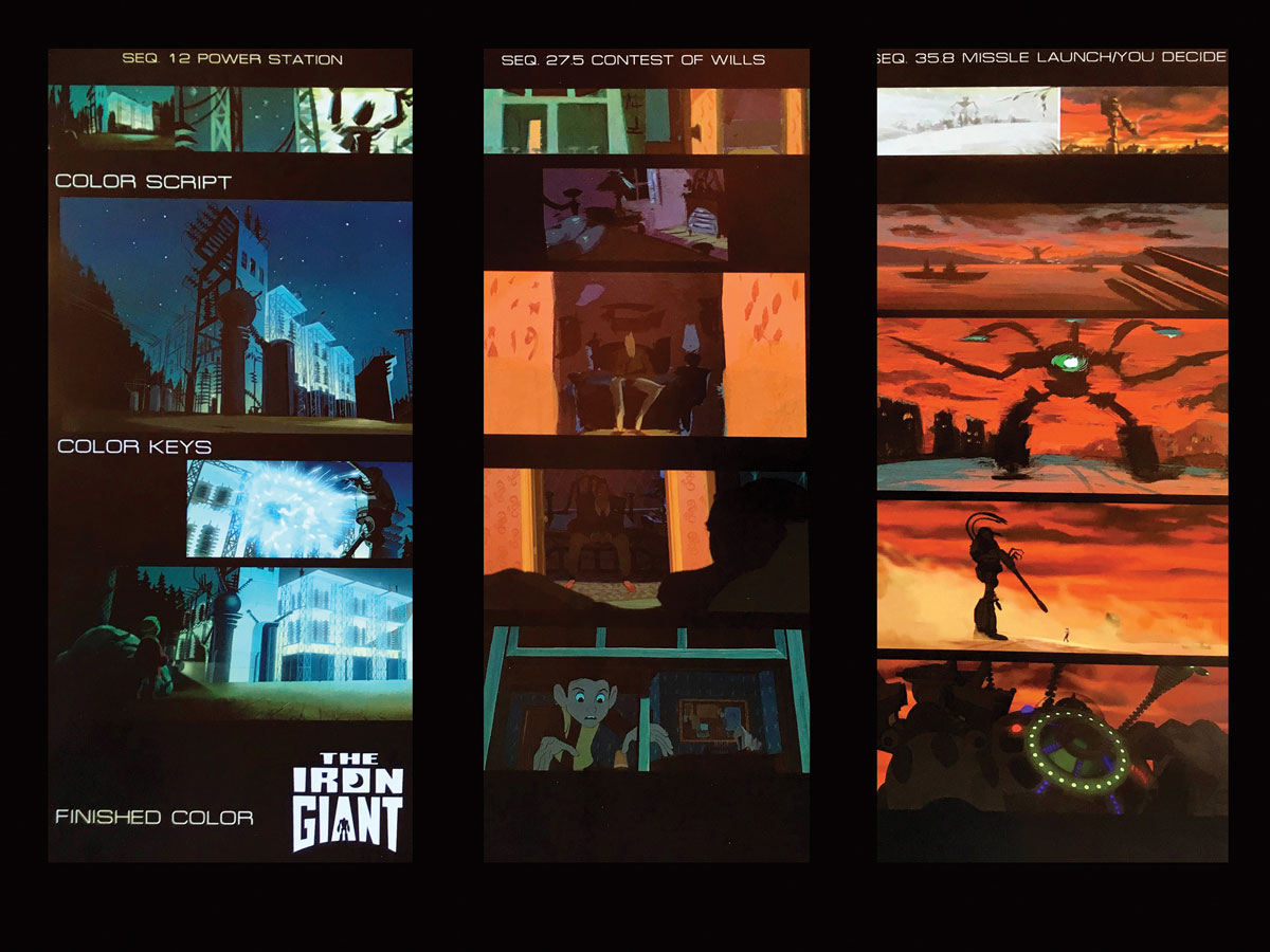
I began going through the storyboards pinpointing key moments to create a color script. Production Designer Mark Whiting really had spent quite a bit of time with visual development pieces, so I wanted to stay true to his initial design vision. That’s when it became interesting to me because I hadn’t ever done color scripts. I had art directed a little bit for Warner Classics, where I was painting and keying backgrounds. On this film I started to understand that it wasn’t just about a single painting; I was really learning to understand how to tell a story through color. I think that’s what Brad imparted to me. I watched movies with him and he would point things out to me. It was like I was going to a college course in cinema. I remember taking frames of black and white films and just copying the lighting. A lot of the films were film noir, filled with mood. The challenge with The Iron Giant was to go from a happy place to a very dangerous one with the film’s color.
As we built toward the final battle, the saturation of color went from bright to muted. The whole idea was it’s getting colder and colder as the giant is starting to transform. Everybody’s really scared of this giant. In order to make the Iron Giant become the gun, the color was desaturated over time. This gave the scene the most impact when the giant gets angry. As the snow comes in, the scene is blanketed with white, and the battle takes place in a blaze of reds.
Color keys courtesy of Alan BodnerIn developing the style for this period in time, we took from many places—1950’s movies, Sears catalogs, the Saturday Evening Post. I collected photos of Maine in the winter and autumn to get those beautiful changing of season colors.
All backgrounds were painted traditionally; in addition, I actually started to use the computer on the job. At Warner Classics, I had spent months painting bullseyes to learn air brushing. Now, I was painting clouds to learn PhotoShop. I worked back and forth with the layout and background departments. It was wonderful working with both Bill Frake (Head of Layout) and Dennis Venizelos (Head of Background). The real challenge was having to impart color direction and style ideas to the department’s crew. Coming from small department at Warner Classics, I had never overseen that many people before. This film was a lesson in how to work with many people and keep it moving forward. Every day, I would go around to each department. I have always felt that to get the best out of an artist, you must let them have a voice. It’s a balancing act. You want the overall look to be unified but you still want everybody to be able bring what they have to say to the table. We had reviews continuously. A lot of those times I was with Brad. I truly felt that if I could get the look to 85 percent, Brad would take it to the finish.
You just knew this was a special film to be a part of. The talent I was surrounded by was incredible. To have taken a leap into a different world and help make something beautiful and memorable was most gratifying. I truly grew from the whole experience. It’s just one of the greatest gifts of my career.
 Licensed by: Warner Bros. Entertainment Inc. All Rights Reserved
Steve Markowski
Supervising Animator
Markowski first met Bird while working as a storyboard artist on The Simpsons. Later, he started working at Turner Animation, developing a film called Wolves, where he did a CG wireframe animation test of wolves being chased by a helicopter. “Brad had seen this test, and when he chose to do The Iron Giant he asked me to do the animation of the giant,” says Markowski.
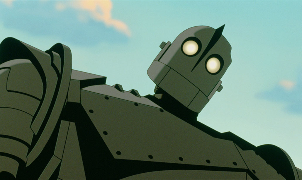
In the design stage, knowing I would be the supervising animator for the Iron Giant, I was coming at it not only from the aesthetic point of view but with an eye toward functionality. How do I express emotion with this thing that we design? Brad always posed two extremes—C-3PO, very un-emotive in his face, and on the other extreme the Tin Man from The Wizard of Oz, clearly a man under makeup. We had seen some early tests before Brad came on and they had a lot of mechanical parts on the face to force emoting, but we thought it felt contrived.
We tried to figure out what was the most we could get away with using the least amount of moving parts. I came up with some theories about the mouth—we didn’t want lips—but if we took our simple hinged jaw and slid it up and down, we could make it express different mouth shapes.
“Making The Iron Giant, we felt like a ragtag team doing something outside the norm and we loved every minute. That’s a rare experience.”
And of course there was no reason why the giant would have expressive eyebrows. He’s not designed to emote; he was designed to be a weapon. But we could believe that he would have protective eye shields. So we used those as eyelids, and by angling them correctly we could use them to express emotion like eyebrows. We also treated the eyes like a light behind a piece of frosted glass—you could make them get brighter or look smaller. Between the two concepts, we were able to get some pretty good expressions. The body was less restrictive but we focused on how to build a robot that is designed to be a weapon which is at the heart of the story.
Brad was always going for a 50’s robot kind of look and because it’s the Iron Giant there was a tendency to make it iron colored and covered with rivets but that started to give it more of an Industrial Era feel. Joe Johnston did some early design sketches where he utilized 50’s like elements—fins on the shoulder and grill work on his chest.
We could go a bit more “alien” when he turns into the battle mode giant—embrace the slick style of 50’s Sci-Fi conceptual work—like when the chest opens he has a more organic shape, and also having a big bubble helmet form around his head. Brad also asked for the The War of the Worlds cobra head tentacles to come out from his back.
Brad wanted to do the giant in CG because he thought it was better suited for a computer but he also wanted it to blend in with the traditional, hand-drawn animation. So, we tried to do as much of the animation on two’s as possible. The technical crew, in particular Brian Gardner, wrote a cel shader that was remarkably good even to the point of giving it wobble in the line like a human hand would draw. We did our best to force as much human aspect into the treatment of the technical aspects, and make it look less CG.
At the time, CG animation tended to not be as refined. It tended to have a very floaty feel so we decided to time it just like 2D animation. We wanted to treat him like a robot—stiff and mechanical in his movement. Emphasizing his weight became vital. His basic walk cycle was 13 frames up and 8 down so his body felt very hard to lift and heavy to drop.
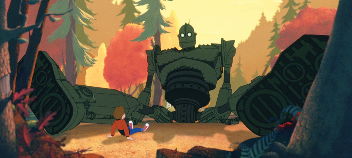
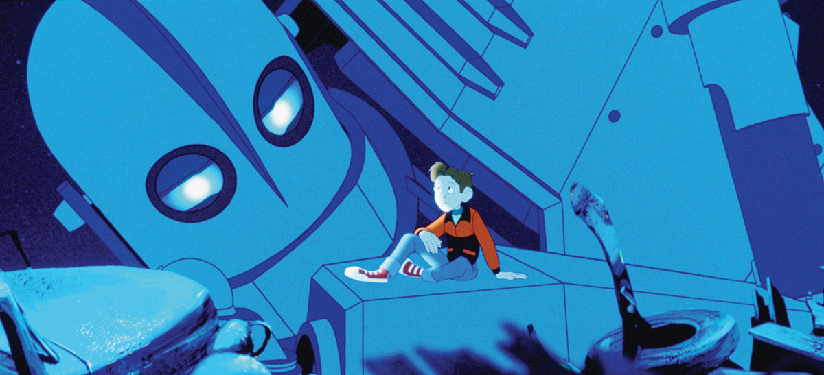
The Iron Giant evolves emotionally and the stages are very clear in the story. The first time you see him he’s just a wall of steel in front of a ship. When Hogarth meets him, we wanted to indicate that there’s some thought process, the tilt of a head, but he’s still mechanical in his motions. Next, he’s watching Hogarth, imitating him, and trying to communicate. In the next stage, we thought of him as a giant puppy who follows the boy home. Then he becomes more of a childhood friend to Hogarth, and as he’s humanizing we started slipping in things like blinking. We have a wonderful scene where he’s questioning whether he’s alive and has a soul. By the end, the giant has, in some ways, moved beyond Hogarth. As he flies up towards that missile and he closes his eyes …we understand that he’s sacrificing himself so that he can live up to his heroic ideal—Superman.
Making The Iron Giant, we felt like a ragtag team doing something outside the norm and we loved every minute. That’s a rare experience. I remember going to see the movie with my wife on opening night in a theater that was largely empty. But there happened to be a father and his young daughter sitting in front of us. Near the end of the movie when the giant destroys the missile, my wife nudged me; I looked and saw the father had his glasses off wiping his eyes. I said, maybe a lot of people aren’t seeing it but what we did really worked. It took a while, but I think the giant’s getting the attention he deserves, finally.
 Licensed by: Warner Bros. Entertainment Inc. All Rights Reserved
Allen Foster
Head of Effects
Returning back to Warner Bros. Feature Animation after supervising 2D effects on Space Jam, Foster set up a digital special effects unit at a time when animation was just starting to encompass more digital techniques and CGI. One of the producers for Space Jam moved over to work on The Iron Giant and recommended him to Brad Bird. “ We met and got along great and from there on, I was his head of effects,” says Foster.
We were all part of a small, tight crew working on this film. As a production unit, we felt isolated from the main Warner lot and determined to prove we were the little engine that could. There was an amazing camaraderie. It was very clear that we were going to be early starters in incorporating digital techniques and CGI into animated feature films. The Iron Giant was being designed in a traditional 2D style set in the 1950’s. I’d already set up a digital effects unit at Warner Feature Animation after returning from Space Jam. This new unit was incorporating compositing tools, particle systems, Elastic Reality and all tools we could find for this digital progression forward. These were early days of CGI animation and for The Iron Giant we were going to be using a beta version of Alias/Wavefront in production.
“In a way, it was a milestone, coming out of a time of total 2D and morphing into what is now a different, fully CG way of producing animated films.”
I knew early on that there was going to be a heavy and dramatic storm sequence at the beginning of the film. I’ve supervised most of my career and I usually take on something heavy just so the team knows to trust how I lead. I had experience creating a storm at sea from working on a Shell Oil commercial with Richard Williams Studio in London. This storm sequence needed all the dramatic effects possible as a lead-in to the film. I decided to use CG for the ocean and soon discovered we didn’t have all the tools available within the Maya software. I ended up buying a game-related CG software to cover functions I needed for the ocean’s surface. After working with the effects team during the day, I would go home and create all the CG ocean animation. I would then render it out and bring it into the studio to integrate into all the other elements.
I needed the CG displacement for some of the surface detail and created the surface shaders that would help give me that very stylized 2D rendered ocean look. Initially, I animated the ocean as one complete piece then broke it up into multiple traditional animation layers and rendered in black and white. I didn’t want to render in color because I would do all that when I composited the final elements together. I could go in afterwards and add gradients and lighting effects sympathetic to the look of the 2D artwork.
We were constantly treading that line between maintaining the 2D style of ‘50s animation while engineering the CGI into the traditional animation layouts and then being able to composite all the new digital elements back into everything else. This is where the digital effects really came in, because I had new tools to create different elements and modify the existing imagery to create the lightning effects with the ability to create a look that was very spatial.
For the final shot of this opening sequence, we needed to show the shipwrecked yet surviving fisherman thrown up on the rocks. This was predominantly 2D effects animation over the CG ocean. We made prints from the existing CG waves then I rough animated the 2D ocean as a guide for 2D effects animators who worked over the prints. Once all the elements were complete we could finesse all the final imagery during compositing.
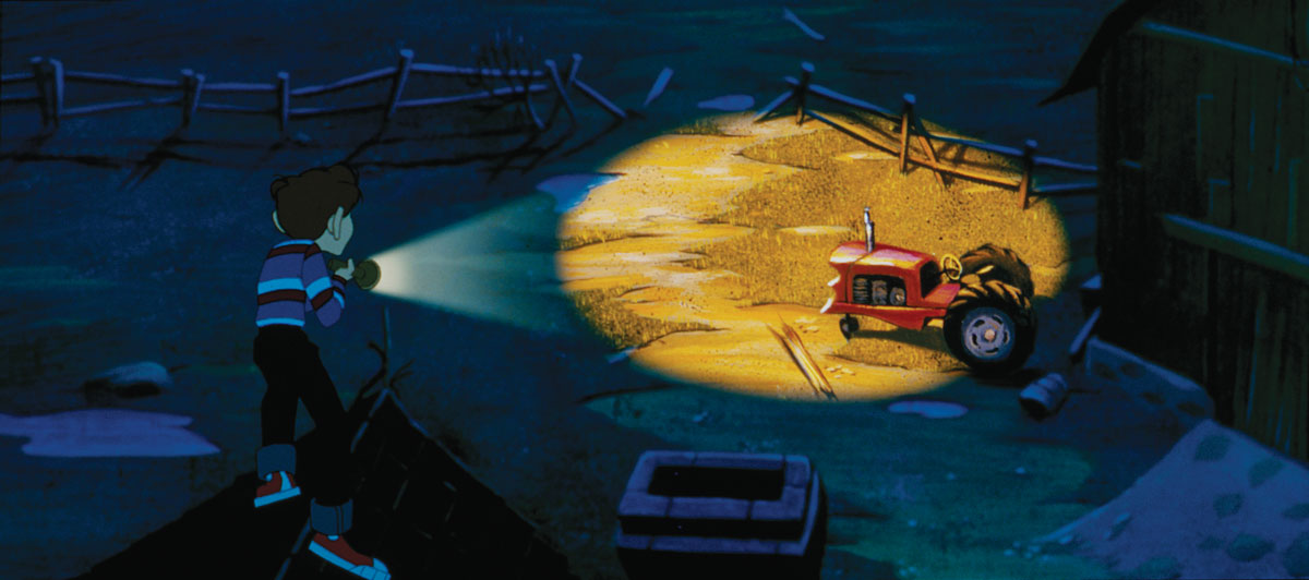
Another sequence, not as complex but one that digital effects made very effective — the flashlight scenes when Hogarth is going through the woods at night. The artwork itself is relatively straight forward but the digital compositing effects proved very effective. How we put it together to get the flashlight lighting effects made a big difference. We were given two backgrounds, one fully illuminated by flashlight and the other at night. We used the night background and overlayed the lighter background where illuminated by the flashlight. We would track the beam and use gradients over the lights to show falloff. As the flashlight [shines] through the trees, we added digital effects to create light shards breaking through the branches and shadows from the limbs of the trees. It’s basically using traditional artwork and then using digital effects for additional creative finesse and enhancements. I am very proud of the dedication and quality of work from the entire effects department on the film.
Brad Bird not only did an amazing job of storytelling and direction but created a film with so much heart that inspired and reflected the love and devotion from this amazing crew. In a way, it was a milestone, coming out of a time of total 2D and morphing into what is now a different, fully CGI way of producing animated films. I’m very proud to have been a part of this amazing in-between stage that really encompassed the transition of both animation worlds.
Jeffrey Lynch
Head of Story
Lynch first met Bird on The Simpsons, where he worked on several of his shows and they directed an episode together. After seven seasons, he joined Bird at Turner to work on a Noir Sci/Fi project called Ray Gunn. “Unfortunately, it got shelved when Turner was taken over by Warner Bros.,” says Lynch. “I went off and worked on another picture for three months, when Brad gave me a call for something called The Iron Giant.”
In the beginning he offered me the head of the story department. I had never done it before so I told him, “Give me a few months, let’s see how I do.” Luckily, I managed to pull it off. The story really spoke to me: It came from a time of Cold War paranoia that permeated my childhood. I remember doing the duck-and-cover drills when I was in first grade, then marching to the “safety” of the gymnasium.
Brad was writing pages, and once I had received them I would look at my crew and say, okay, who’s best suited for this material? Who’s going to really make it shine? If it’s got more action, then obviously Mark Andrews. If it’s all about acting, it’s going to go to Viki Anderson, who really had a spirit with characters.
“We were all young and we were all hungry. We wanted to work on something that would make a difference. We didn’t want to talk about the good old days, we wanted to blaze new territory.”
Sometimes there were things that I knew weren’t working and I would assign someone on the side to try to come up with a solution. I wanted to see if we could crack it before pitching it to Brad. He welcomed that interaction; I felt like we had a lot more freedom. Brad did some great pages on Dean and Annie [Hogarth’s mom] dating. It was an earlier version, which is not in the final film. The stuff was hilarious and we were boarding it, but I had to go in and say, “This is a story about a boy and his robot, and we’re starting to spend a lot of screen time on a love story.”
Dean Wellins has a great story sense. He’s a big guy. He stands like six and a half feet, and one day I felt his looming presence in my doorway. I looked over and he had this very unhappy look. He had been working on a lot of material about the trials and tribulations of how the boy would prevent the town from discovering the giant. We spent so much time on it that the giant had become a burden. Wellins said: “If I was a little kid and I had a giant robot, I’d be having some fun.”
It’s one of those things that’s staring you in the face and it becomes painfully obvious after someone mentions it. The scenes with Hogarth and the giant playing “flying car,” and jumping in the lake, for example, came out of that conversation. At the same time, it gave us a vehicle to start weaving Dean, Hogarth and the giant together emotionally.
One scene that stuck with me was the death of the deer in the forest, where the Iron Giant learns about the concept of life and death. I can’t recall if we got pages or whether it was something Brad pitched to us, but I do remember that it was Dean Wellins who boarded it. It was a really difficult pivotal moment to deliver. The scene starts very fun, then turns into something serious and profound. That leads into my second favorite scene, which is later that evening at the junkyard. The giant is pondering what has happened that day and Hogarth talks with him about: what is life, what is death, what is a soul?
At the end of that second scene was one of my favorite storyboard sequences, also done by Kevin O’Brien, that wasn’t in the original film—a dream sequence broadcast from the giant’s mind that Dean actually sees on his television. It scares Dean half to death because, essentially, we see a glimpse of the Iron Giant’s original purpose—as a planet killer. It was very stylized and cool. Unfortunately, it wasn’t included in the original release because the picture ran out of time and money.
We were on a really compressed schedule and just trying to get it done was really tough. We were all young and we were all hungry. We wanted to work on something that would make a difference. We didn’t want to talk about the good old days, we wanted to blaze new territory, and Brad has this fire in him that challenged us to push ourselves to higher levels.
When I saw it at the premiere, I knew it was great. But leading up to it I was immersed on For the Love of the Game. I hadn’t seen any billboards, hadn’t seen anything in the paper, hadn’t heard any press and I’m thinking, what’s going on? So it was pretty disappointing to realize that this incredible film had been made and no one knew about it.