First of all, the characters now have to talk and move in three dimensions. Yeah, this seems like a pretty basic function that anyone turning a book into a movie or TV show must perform. After all, in a favorite fairy tale, chapter book, or graphic novel, the author and/or illustrator lay all of the groundwork. But once you transplant that child, deer, ogre, mad scientist, or robot onto the screen, the character is going to have to move and speak within a world that you will have to create. On top of that, the whole package—characters and world—must be convincing or diverting enough so that your audience isn’t sitting there for 12 to 90 minutes thinking, “But the book was so much better.”
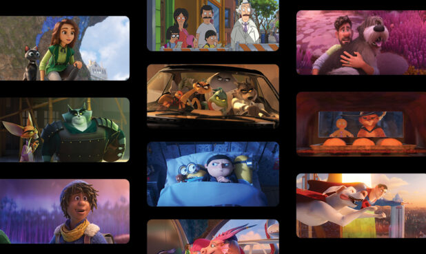
If this sounds like a daunting proposition, the artists and writers who work in animation will remind you that it’s a regular part of the job. As exciting as it is to bring a Raya and the Last Dragon or The Mitchells vs. The Machines into the canon, there are many more animated titles that began life in a different form.
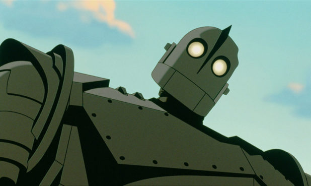
“I think Hollywood loves to stake claim to the general population’s mental real estate, and the real estate you have in your mind contains a lot of different things you’ve read over time or stories you know,” says Dean Wellins, a Character Animator and Story Artist on multiple Disney films and Lead Animator and Story Artist on The Iron Giant. “If they can do a new version of something so that they don’t have to reintroduce brand new characters to people, they will. It’s much riskier to try to get everybody on board with characters they’ve never heard of before.”
Filmmakers have been mining works of literature to turn into animation since the genre was invented. With contemporary adaptations, sometimes the author of the book is present to work on the project, offer creative advice, or just give their blessing. In other cases, they may have died decades or even centuries ago, allowing filmmakers liberty to rework the story as they see fit. Are there actually any Hans Christian Andersen purists out there who are angrily lamenting the transformation of Andersen’s The Snow Queen into Disney’s Frozen?
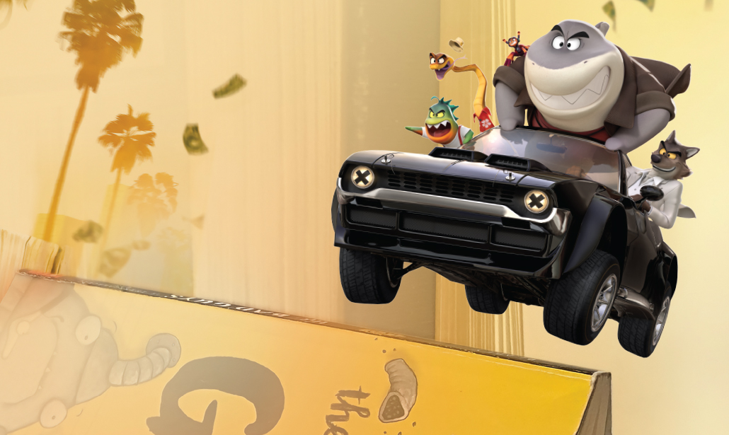
Floriane Marchix, Art Director on the new DreamWorks film The Bad Guys, has worked on adaptations where adherence to the book was not a strict requirement and other projects where the author controlled the reins more tightly—most notably her experience bringing kid lit favorite Captain Underpants into theaters for Captain Underpants: The First Epic Movie. She says the approach to each movie was entirely different. Unlike with Captain Underpants, where the team had to follow the drawings “a lot more strictly” while adapting the books, there was room in The Bad Guys for more creative license.

The Leeway Freeway
In scripting The Bad Guys, Screenwriter Etan Cohen knew he had plenty of creative leeway, but he also wanted to include material to please the books’ fan base.
“Even though there is a macro arc to the books, they’re meant more to be told in episodes,” says Cohen. “You’ve got to transfer that into a shape that works well as a movie. So, you look at the whole menu of books and try to figure out the bits that make one good story. The way I tried to do that was looking at big themes that we could pull out of the books.”
“…you look at the whole menu of books and try to figure out the bits that make one good story.”—Etan Cohen
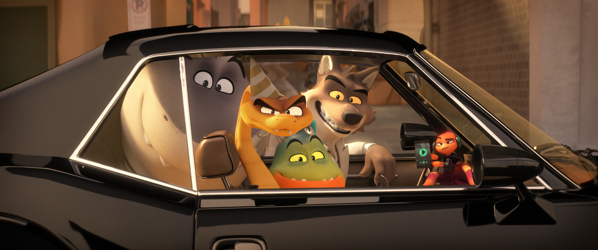
Cohen had his pick of themes, such as everyone has the potential to change. The Bad Guys series recounts the adventures of a group of scary animals who, tired of being demonized, decide to make over their image while also plotting a heist. “Going good” is no easy lift, and the partnership between Mr. Wolf, Mr. Shark, Mr. Piranha, Mr. Snake, and Ms. Tarantula hits more than a few speedbumps.
The book series’ fan base may miss favorite plot lines or wonder about certain changes. The character of Mr. Tarantula, for example, became Ms. Tarantula to add a female presence. In addition, the world created by the books’ author, Aaron Blabey, contains only animals, where the universe of DreamWorks’ The Bad Guys includes human beings, as well.
To make the books cinematic, Cohen, Director Pierre Perifel, and the team turned to some cultural reference points from movies that people of different ages might recognize. Those cool black suits and shades worn by our quintet evoke the crooks of Reservoir Dogs and the alien chasers of Men in Black. The movie also pays homage to George Clooney and the heist-minded hipsters of Steven Soderbergh’s Ocean’s Eleven.
“The movie has been informed by a love of the same things that have driven me to create the book series,” says a delighted Blabey. “I think that is because we’ve completely shared that common language which is very cinematic. When I was making the books, I never pictured that kind of sun-bleached L.A. and the whole Tarantino and Soderbergh universe. [But] as we went on, there was never a single point in the visual sense where I went, ‘I’m not sure that’s right.’”
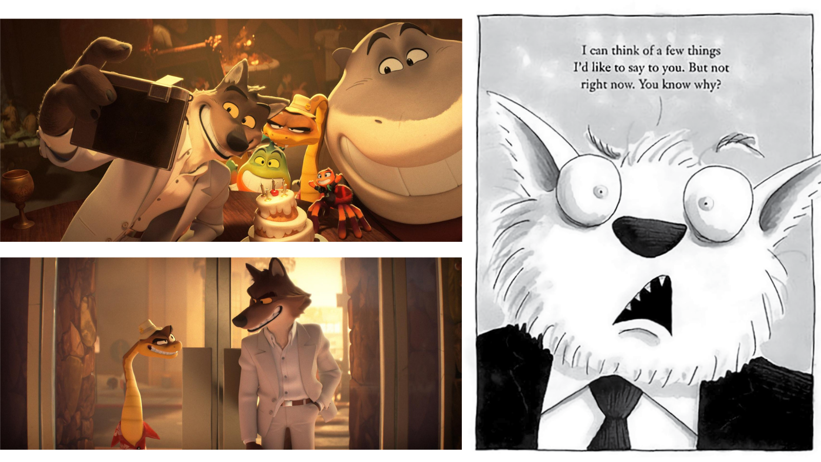
The books are illustrated, but the aesthetics of The Bad Guys’ cinematic universe is positively eye-popping, a blend of CG and 2D that artists say breaks new ground for DreamWorks animation. “In recent years, [DreamWorks] has upgraded its rendering system to give you very accurate physical lighting,” says Perifel. “I came in and said, ‘No, I don’t want that.’ I wanted something more painterly and illustrative that had more line effects.”
Applying this technique to animals proved to be a somewhat “hairy” proposition, especially in the case of characters like Mr. Wolf and Governor Diane Foxington. “I didn’t want the rendering to get in the way of the characters,” says Luc Desmarchelier, the film’s Production Designer. He explains that CG tools have a tendency to render every detail, and as an artist, that wasn’t how he saw the world. “If I paint hair, I’m not painting every single hair. You want to give the impression of hair. That’s what we were trying to do in general with the look of the movie.”

Creative Balancing Acts
Justin K. Thompson reported similar difficulties in 2009 when he worked as the Production Designer on Cloudy with a Chance of Meatballs. While looking to create a hand-drawn, graphic aesthetic, Thompson said, filmmakers had to essentially trick a computer that was trying to actualize everything. Thus, new software was needed for Cloudy and its sequel, Cloudy with a Chance of Meatballs 2.
Thompson notes the ginormous Jell-O mold in the original Cloudy that Flint Lockwood and Sam Sparks—characters invented for the movie—penetrate and bounce around. “That was the hardest thing to render in the whole movie,” he says. “Instead of building it as component parts, we built it as one continuous piece of double-sided geometry that included all the set, the statues, and all of the furniture. So all of the reflections in it are real. All of the ripples when they bounce on it are real.”
Devotees of Cloudy the book, written by Judi Barrett and illustrated by her husband Ron, won’t find many similarities between the book and its adaptation. That was deliberate. The filmmakers studied children’s books for inspiration, but not so much the original source material, according to Thompson.
“We’re combining [the three books] into one world, so we had to figure out what are the edges of the world?” —Chris Nee
In creating Flint, Sam, and the residents of Swallow Falls, the aim was characters with a distinctly cartoony look with big heads and gangly bodies. Plot-wise, Writers-Directors Phil Lord and Christopher Miller also upped the wackiness/mayhem quotient. Lovers of the Barrett story still got to witness an enormous pancake draped over the school and a spaghetti tornado, but Lord and Miller steered away from the cautionary tale spun by the Barretts.
“In the book, the main character is an old man telling a story to his grandchildren about something that happened,” says Thompson. “With Phil and Chris’s interpretation, they wanted to make it more contemporary and give it a more youthful feel. And we wanted to feel a silliness. [After all], it’s a movie about giant food falling from the sky and crashing into buildings.”


The makers of the Netflix TV show Ada Twist, Scientist, on the other hand, confronted a different sort of balancing act. In making a show for preschoolers that emphasizes the value and endless possibilities of science, Executive Producer Chris Nee and Showrunner Kerri Grant looked to deliver an experience that was entertaining but also rooted in scientific principles and methods. The show takes not only the adventures of the title character, but also Ada’s best friends Rosie and Iggy, the heroes of author Andrea Beaty’s other books, Rosie Revere, Engineer and Iggy Peck, Architect.
“The three books had different rules on what was science-based and what was whimsically-based,” says Nee. “We’re combining them into one world, so we had to figure out what are the edges of the world? How far does fantasy go? We landed on the middle ground. We really liked the idea that we had a science show and a character who was super into unicorns and dragons and sci-fi.”
The Kids are All Right
Robert Brown brandishes the collection of Lincoln Peirce’s Big Nate comic strips as though he is holding the book that has all the answers.
“This,” says Brown, a Character Designer on the new Nickelodeon series, “is our bible. We’re always going back to the strips because there’s so much material there. We had an episode that required a squirrel, so we went back to see whether Lincoln had ever drawn a squirrel. We’re trying to maintain his design language as much as we can.”


Nate Wright, the central character of Peirce’s strips and books, is a trouble-prone sixth grader who is also an aspiring cartoonist. His antics resonated with Art Director David Skelly who also had dreams of being a comic book artist. Skelly’s career includes Muppet-building at The Jim Henson Company, and his eclectic resume—particularly his puppeteering expertise—are part of what made Executive Producer and Showrunner Mitch Watson tap him to help guide Big Nate from the comics into his TV series.
“We’re always going back to the strips because there’s so much material there.”—Robert Brown
The overall design concept centered around giving the characters a hand-made, hand-painted look, much like what you might see in stop-motion animation. “Having been a puppet fabricator for stop-motion, it was easy for me to make that leap,” says Skelly. “The idea was to make the show a little like the Rankin/Bass holiday specials of the 1960s and 1970s, to capitalize on the perfect imperfections of hand-made objects.”
Among the people Skelly enlisted were some with specialized backgrounds in comic art: Vicki Scott, who had worked on Peanuts comics, and Sang Jun Lee, Lead Character Designer on The Peanuts Movie.

Skelly and Brown both cite the challenges of turning a comic book figure like Nate and his friends into three-dimensional animated characters. Take Nate’s hair, for example—six fronds on his head that always look the same from the front or side. “How can we take that and make sure we’re hitting the silhouette and making it work from different angles?” says Brown. “We eventually got to a point where we felt pretty good with the marriage of CG and two-dimensional line texture vibe.”
For the Apple TV+ series Harriet the Spy, the team at Titmouse faced its biggest hurdle less with the kids, and instead with the creation of Ole Golly, Harriet’s gruff nanny. The 1964 middle grade classic was written and illustrated by Louise Fitzhugh. Background and Character Designer Yves Menshikova conducted extensive research into the look of the period. In their first pass, they drafted Ole Golly as a Mary Poppins figure. But their initial renderings were sent back with instructions to make the character frumpier and more utilitarian. Make her look more like Anjelica Huston.
“I was thinking a lot about the ‘60s and New York,” Menshikova says, explaining that they looked at New Yorker covers and specific illustrative styles that felt like pen and ink on paper.


Ole Golly was toned down into a less elegant and more dependable figure, “very no-nonsense,” says Menshikova. “She took quite a few passes to get right, and eventually [Character Designer] Jacob Ospa nailed her final look.”
Ospa, also a Storyboard Supervisor, Animation Retakes Director, and designated “Ole Golly cracker,” had his own adapting challenges on Harriet. “I gravitate toward more exaggerated, cartoonier character designs, whereas the look we were going for was more innocent and naïve, like what you would find in an actual childhood book,” he says. “I remember I had to design some dogs, and at times my dogs had too much anatomy in them.”
However an adaptation from book to screen is approached, from replicating the original to expressing full creative freedom, the artists involved tend to have one common goal: When the story hits the screen, is should capture “the spirit of the book.”