Since the start of animation as an industry, one of its abiding missions has been to perfect drawings in motion. With CG, this goal expanded to make animation that feels as realistic as possible. But to honor its 100-year anniversary, Walt Disney Animation Studios shifted into reverse.
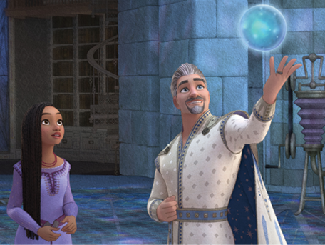
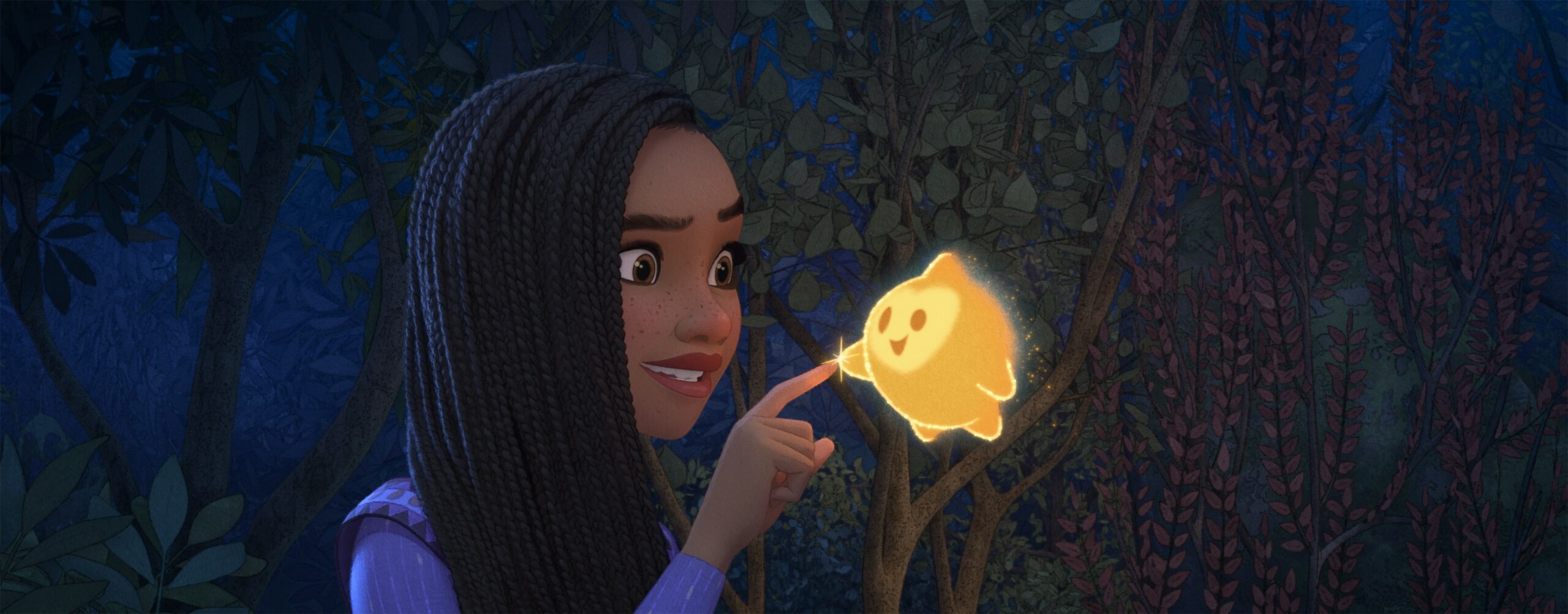
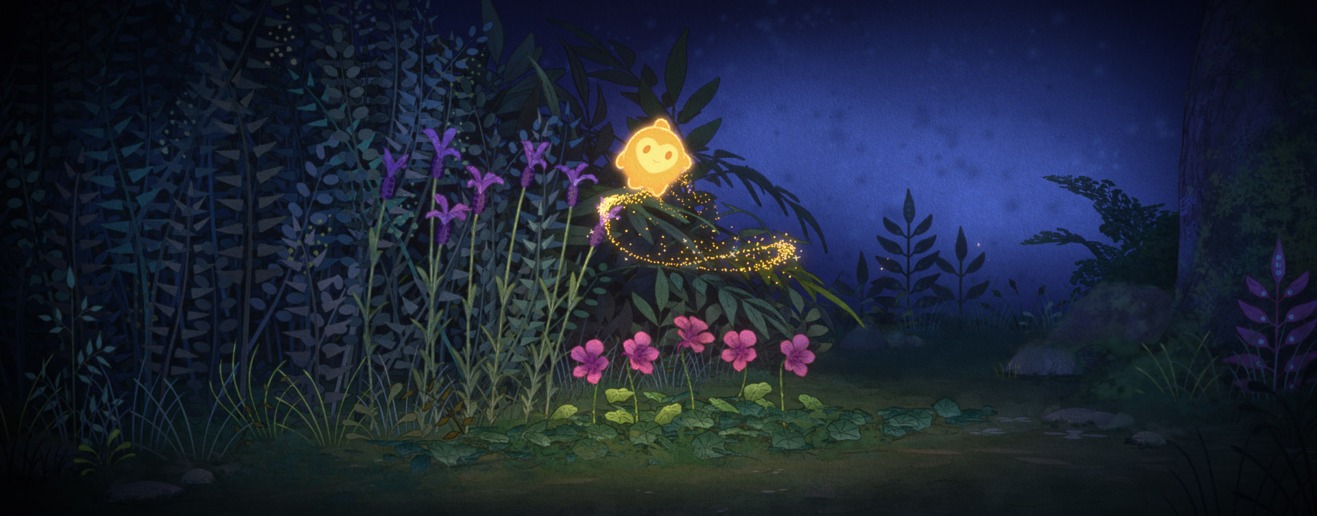
Looking back to some of the studio’s earliest films for inspiration, the comedy-musical Wish is the story of 17-year-old Asha, an idealistic commoner who dreams of being the apprentice to King Magnifico, the ruler of the land of Rosas. King Magnifico has the power to grant the wishes of his subjects, but when Asha discovers what he actually does with these wishes, she makes her own wish so strong it invokes a cosmic force in the form of a lively, powerful star. Together with a pajama-clad goat named Valentino, Asha and Star set off to save the wishes of Rosas.
While the story is original and Asha is a heroine rather than a princess, Wish resides comfortably in the spirit of Disney’s classic fairy tales. “Gustaf Tenggren and Kay Nielsen are two of the many [early] Disney animation artists who inspired our look,” says Avneet Kaur, Head of Characters and Technical Animation. Born in Sweden, Tenggren designed the evocative backgrounds including the cottage and deep woods for Snow White and the Seven Dwarfs, and he is perhaps best known for the brooding atmosphere of Pinocchio, introducing the illusion of depth he had used in his illustrations for books like Hans Christian Andersen’s Fairy Tales. Hailing from Denmark, Nielsen illustrated classic fairy tales in a dark, dramatic style that blended influences from Art Nouveau to Japanese woodcuts; during his short but influential time at Disney, he designed the memorable “Night on Bald Mountain” sequence in Fantasia.
While there was no intention of stepping away from CG technology, according to Production Designer David Womersley, there was a desire to capture the artistic atmosphere of the old films. The filmmakers did more than study who crafted them, though. They thought, “What if we look even further back?” says Womersley. “Walt Disney, when he was a little kid, and these [animators] when they were young, they would be looking at these beautiful illustrated books from the turn of the century. There were people like Charles and William Heath Robinson, John Bauer, Edmund Dulac, William Russell Flint—these amazing watercolor illustrators that the people who did Pinocchio and Snow White would have been [able to] go to.”
Going the Distance
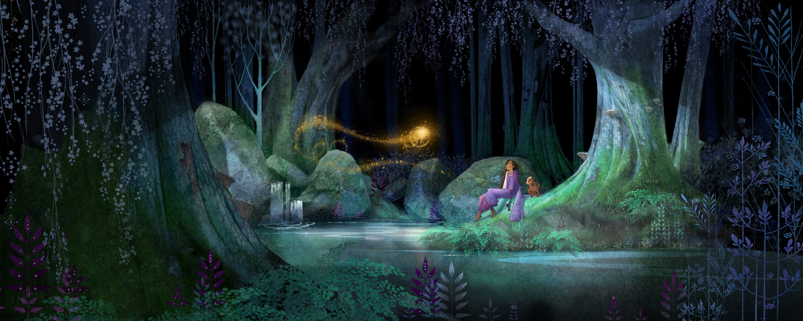
Animating rich watercolor illustrations to create a living storybook became the driving aesthetic vision for Wish. But they couldn’t just layer a textured watercolor pattern over the top of the scenes. This would cause what is known as the shower door effect. “What we had to do was come up with a technique that had never been done before,” says Kyle Odermatt, Visual Effects Supervisor.
A significant component of the look of a watercolor painting is the textural quality provided by the tooth of the paper. “If you’re painting an object in the distance on watercolor paper, that texture created by the tooth of the paper will appear very large relative to the object,” Odermatt says. “For example, a house in the distance is drawn much smaller than a similar-sized house up close to maintain perspective. If you were to bake the paper texture into the closer, larger house and shrink it to represent a more distant house, the texture would feel too small and make them not seem like part of the same watercolor painting.”
To recreate this effect, Odermatt says, “You adjust this textural pattern across everything in the scene on any given frame” so that it appears that the watercolor paper texture is always the same size irrespective of distance, maintaining the illusion that the artwork is all of one piece. With the technology that was created to address this issue, “as something moves away, the texture actually gets larger on it, and if something gets closer, the texture gets smaller, so that everything on the screen has a consistent textured size overlay to it. That’s the dynamic component of the system. It has to change over time if the camera moves or if an object or character moves onscreen.”
An added challenge is that storybook illustrations of yore used more than just watercolor paint. “These are not pure watercolors but watercolor illustrations that have an ink line component over the top,” says Odermatt.
The classic illustrators would do a sketch, then paint with watercolor before going back with dark (usually black) ink and drawing in lines to help define the illustration. “We’re doing the same thing,” Odermatt says. “We’re computing lines that could go everywhere if you saw the line render pass. But then we modulate that very carefully based on what we want you to look at and where we want you to look in a given frame.”
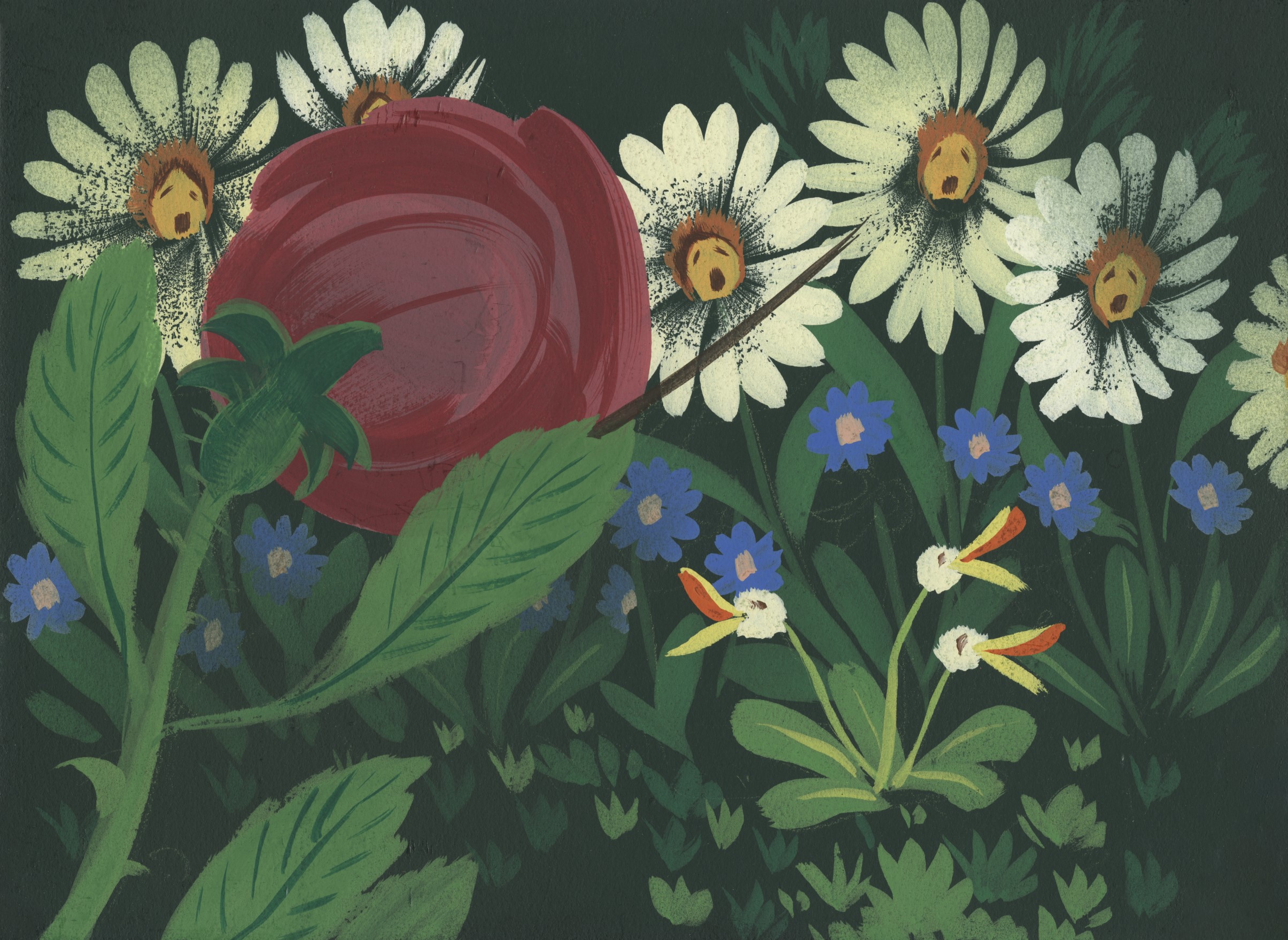
The storybook look was also achieved by not using any optical depth of field. Odermatt says this was a big challenge for the filmmakers because “we’re used to blurring things in the background or blurring things in the foreground that gives us a certain control over what the viewer looks at. In illustration that isn’t the case. They don’t tend to paint things blurry. They tend to paint things with less detail they don’t want you to focus on and add detail where they do. Irrespective of distance from the viewer.”
This technique was applied not only to objects and buildings in the background, but also to characters. “Based on visual development’s beautiful designs, our talented modeling team crafted 27 unique faces and many body types to represent the various age groups of the people of Rosas,” says Kaur. “Our cloth simulation team created many modular garments that could be mixed and matched to create outfit variations. On top of outfit and hairstyle variation, Character Look Development’s primvars (primitive variables) toolset workflow allowed for the potential of hundreds of thousands of different combinations of colors, patterns, and textures.” In the foreground all of this detail enables visibly distinctive variety, but as characters recede into the distance, “detail is reduced, lines are offset from bodies, and groups are clumped into sections of color so that they almost become a part of the architecture,” says Kaur.
Our look is very stylized … When we look back at the illustrations from the turn of the century, there’s such [a] distinctive way of framing.—Fawn Veerasunthorn
Frame of Reference
One of the concerns of creating such beautiful illustrations is that “you don’t want anything in the background to become the star of the show,” says Womersley. “It’s the characters you really want to follow because it’s their story.” But you also want to make the most of the striking illustrations. To do this, he says: “We always try to get in as many beautiful establishing shots [as we can]. That’s a thing that comes from the older [Disney] films.”
Fawn Veerasunthorn, who directed Wish alongside Chris Buck, describes the emphasis on composition and framing for shots like these: “Our look is very stylized, and the way we frame our shots should reflect that as well. … When we look back at the illustrations from the turn of the century, there’s such [a] distinctive way of framing.” She says the filmmakers worked with the production design team to break down the techniques of early Disney animation illustrators. This was done in black and white so the filmmakers wouldn’t be distracted by color and could focus on how to use framing to help define a character.
They also studied how the multiplane camera was used in classic Disney films. Invented at Walt Disney Studios in the 1930s, this camera could film several planes (layers) of drawings for the foreground, middle ground, and background, and then the lens could focus on the relevant plane to create an illusion of depth. “This led us to the conclusion that when we shoot [Wish], let’s practice self-discipline on not moving the camera [as freely as] we usually do in a CG movie,” says Veerasunthorn.
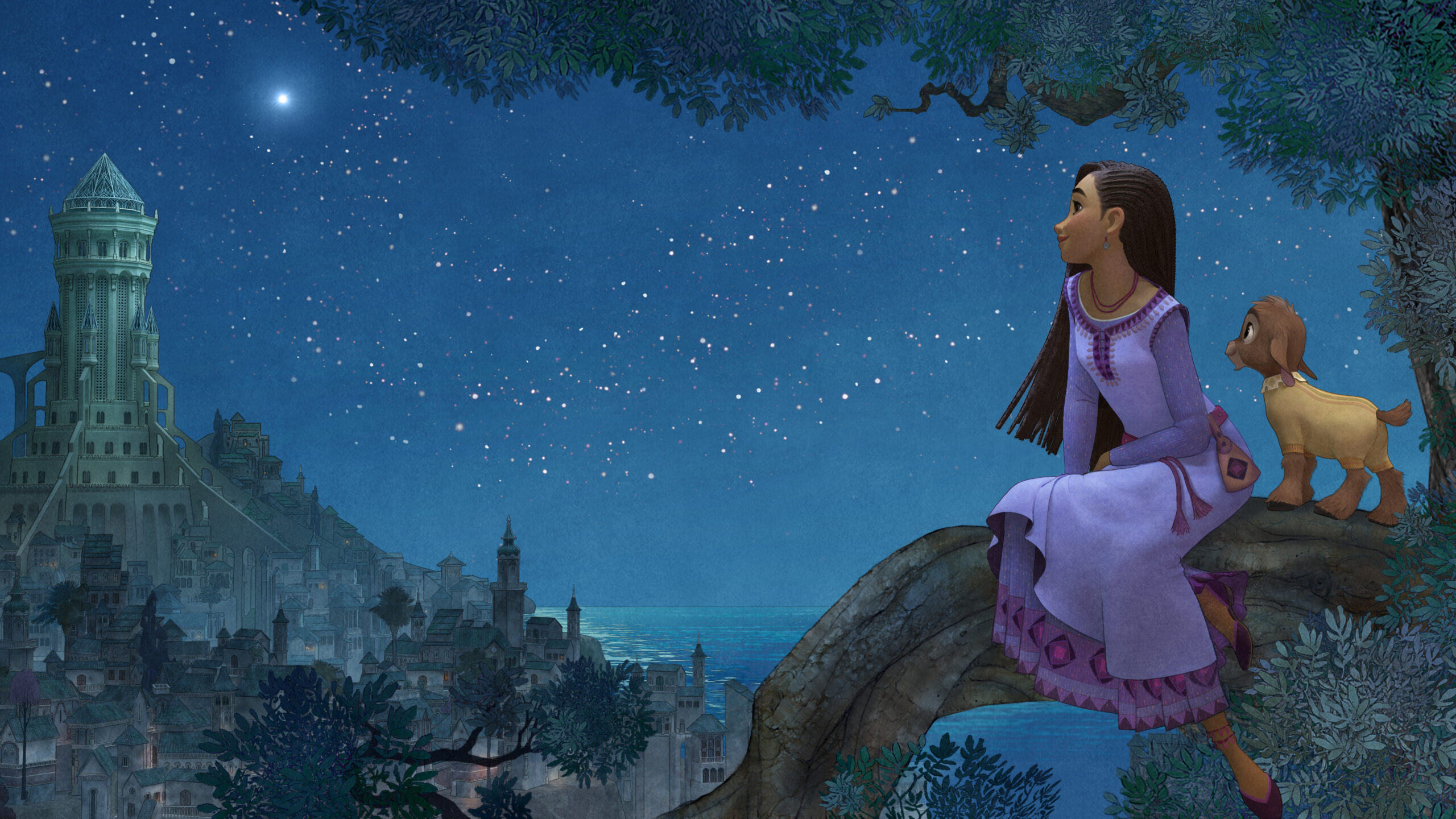
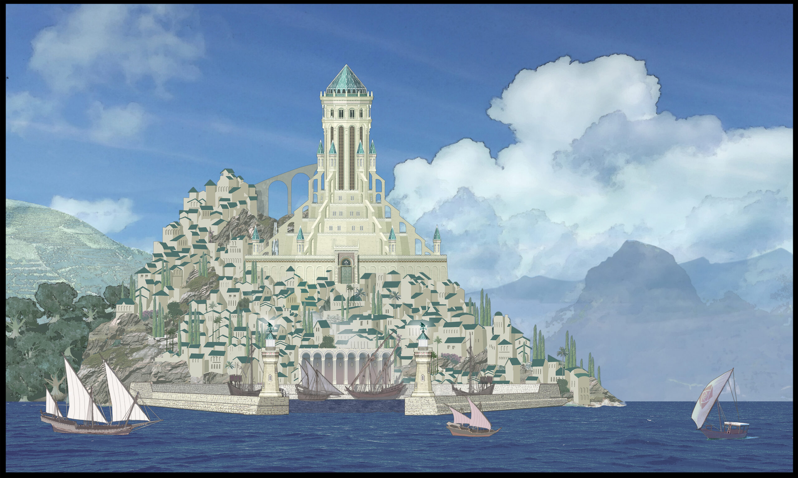
While Wish is nostalgic, the filmmakers wanted it to feel like more than a blast from the long-ago past. This can be seen in numerous ways, from the pop soundtrack—there’s even an electric guitar in King Magnifico’s big scene—to the color palette. “Fairy tales tend to be set in Middle Europe, Northern Europe, kind of gothic,” says Womersley. But Wish is set on a fictional island off the coast of the Iberian Peninsula, “and with that you have [the] light, the azure Mediterranean Sea, the incredible colors of the foliage. That really pushed a lot of the freshness.”
“I love the duality that we always keep two things in mind.” says Veerasunthorn. “How do we honor the legacy, and how do we make something new.”